Before I Buy a Single Piece of Furniture, I Draw the Room

The second design tool I’ve relied on for years—and why a furniture layout can save you from expensive mistakes.

In my last post, I shared how I create mood boards and why I’ve continued using them for more than 16 years.

Mood boards help answer one big question:

What should this room feel like?

But there’s another design tool I consider just as important—maybe even more important before you start buying anything.

The furniture layout.

I’ve been drawing rooms for as long as I can remember.

Even when I was little, I loved sketching houses, floor plans, furniture arrangements and different ways a room could work. Long before I was doing it professionally, I was already thinking about space this way:

What fits here? What happens if the sofa moves there? Could the bed go on another wall? Is there enough room to walk around everything?

That habit eventually became one of the most useful tools I use as an interior designer.

A Pretty Room Starts With a Plan

It’s easy to begin decorating with the fun part.

A beautiful sofa.

A rug you love.

A great coffee table.

A pair of chairs you saw online.

But a collection of beautiful pieces doesn’t automatically create a well-designed room.

They have to fit the room—and fit together.

That’s why I like to work out the furniture layout before making major purchasing decisions.

A basic floor plan can immediately tell you:

  • What furniture will actually fit
  • The right approximate sizes and proportions
  • Where the major pieces should go
  • Whether you have enough circulation space
  • What you already own that can stay
  • What’s missing
  • What you should—and shouldn’t—shop for

Suddenly, the room becomes much easier to understand.

Your Furniture Layout Becomes an Inventory

One of my favorite things about creating a furniture plan is that it gives you a visual inventory of the room.

Instead of thinking:

I need to decorate my living room.

You can see:

Sofa — staying
Two chairs — needed
Coffee table — staying
8’ × 10’ rug — needed
Floor lamp — needed
Console — possible, depending on depth

That is a completely different way to shop.

You’re no longer randomly collecting furniture and accessories hoping everything works together.

You have a list.

And more importantly, the list is based on the actual space.

It Can Also Become Your Shopping Guide

This is where room planning gets especially useful.

Your floor plan can become the beginning of your shopping guide.

If your layout tells you the room needs a sofa approximately 84 inches wide, you now have an important filter when you shop.

If the room needs two chairs but only has room for chairs around 30 inches wide, you can immediately eliminate oversized options.

If the plan shows that a 60-inch console will overwhelm the wall but a 42-inch piece works beautifully, you know exactly what to look for.

Instead of asking:

“Do I like this?”

You start asking:

“Does this work in my room?”

That one shift can prevent a lot of expensive mistakes.

Try More Than One Layout

I rarely think there is only one possible furniture arrangement.

Often there are several.

For a living room, I might test:

  • A sofa facing the fireplace
  • A sofa facing the main view
  • Two sofas opposite each other
  • A sofa with two swivel chairs
  • A sectional
  • A conversational arrangement with four chairs

The purpose isn’t to make the process complicated.

It’s the opposite.

You’re testing your ideas on paper before testing them with your money.

Sometimes the arrangement you assumed would work isn’t the strongest option at all.

And sometimes moving one piece completely changes the room.

Draw First. Shop Second.

This is one of the simplest design rules I can give you.

Before buying furniture, know:

Where it will go.
How large it should be.
What needs to sit beside it.
How people will move around it.
What else the room still needs.

Then your mood board and your furniture layout can work together.

The mood board gives you the look.

The floor plan gives you the structure.

Together, they give you a real design direction.

This Is Exactly What We’ll Work Through in the Room Redesign Challenge

In the upcoming 30-Day Room Redesign Challenge, we’re going much deeper into this process.

We’ll work through the room step by step—from inspiration and mood boards to measurements, furniture layouts, what stays, what goes, what you need to buy and how to bring the entire room together.

The goal is to stop guessing your way through decorating and start making decisions with an actual plan.

A new room each month, with daily designer direction to help you transform it from start to finish.

The challenge begins with Entry + Living Room, and it’s available to paid subscribers.

Subscribe now to join the challenge and start planning your room with me.
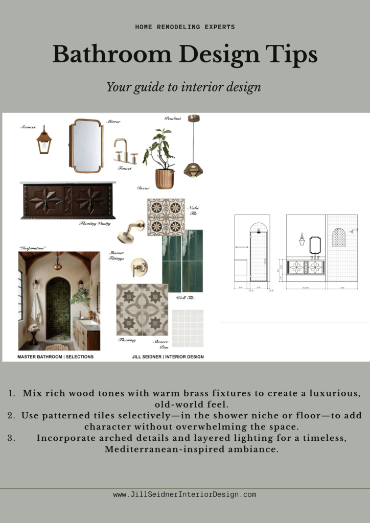
Design Process: How I Designed A Tiny Bathroom

Last year, a client contacted us about renovating her 1920s Spanish Revival home in San Pedro, California. The house still retains much of its original architecture, and our objective was to renovate it with respect for its integrity while also modernizing it.

One of the first designs I worked on, was a tiny bathroom off the master bedroom. We needed to accommodate a larger vanity and extend the shower into a neighboring closet.

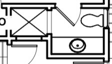
The basic house drawing plan started like this:

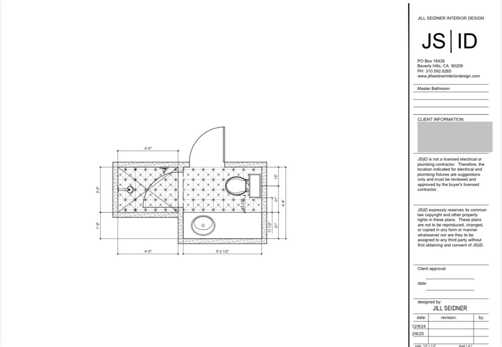
Because it was a very tight distance between the sink at the vanity and the toilet, I suggested off-centering the sink, so there is more space when standing at the vanity. The new floor plan showcases a larger shower that went into an existing closet and the off-centered sink creating more usable countertop space.

New proposed detailed floor plan with tile layout.

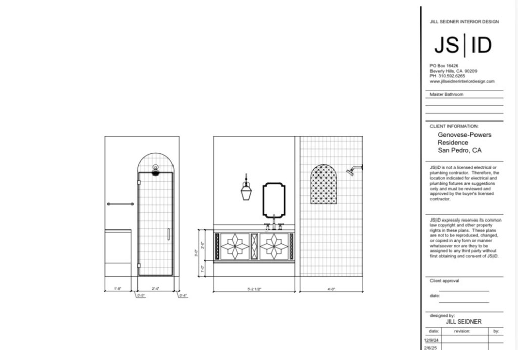
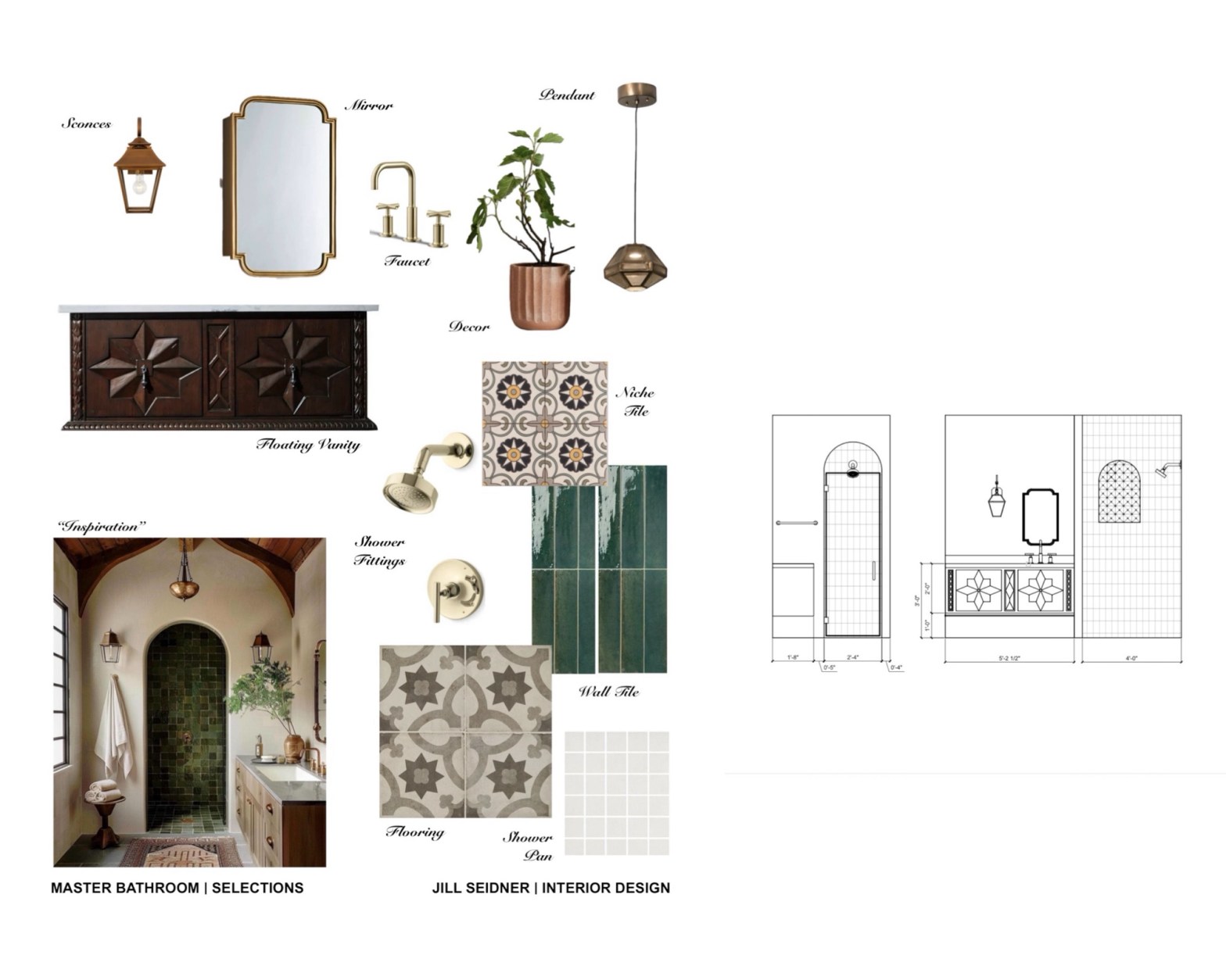
For the vanity design, the client found a vanity style she liked and I replicated it to create a custom floating vanity. We incorporated a mirror that complements the Spanish Revival style and a lantern for sconces inspired by a concept photo I had suggested.

Elevation drawing with vanity design & tile layout.

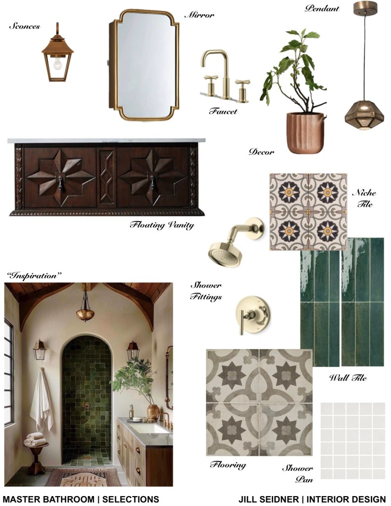
For the finish selections, I created a concept board inspired by a photo and incorporated color and concrete tiles with a pattern to compliment the Spanish style to make this small bathroom truly stand out.

Selections concept board.
Here are some design tips inspired by this bathroom design:

Color Combination Suggestion: Mix rich wood tones.

Fixture Color: Warm brass.

Desired Atmosphere: Luxurious and old-world.

Tile Usage Recommendation: Use patterned tiles selectively.

Suggested Locations: Shower niche or floor.

Design Benefit: Add character without overwhelming the space.

Desired Ambiance: Timeless, Mediterranean-inspired.

Design Elements: Arched details and layered lighting.

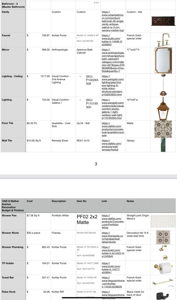
Here’s a list of the sources we used for this project.

For more design tips, sign up here: https://stan.store/YourDesignGuide

One Bathroom, Two Ways

For the last year, I’ve been working on a home renovation project for a beautiful 1920’s Spanish Revival in San Pedro, CA.

Much of the design planning had started late at the end of last year and into the beginning of this year. While construction has still been going on, my client emailed me in June, wanting to completely redesign one of the bathrooms we had long finalized.

It’s a small bathroom in a downstairs basement area. The original idea is that it would retain the Spanish style look that is consistent with the rest of the house and architecture, but also be a bathroom for her husband with some slightly more masculine touches (matte black hardware).

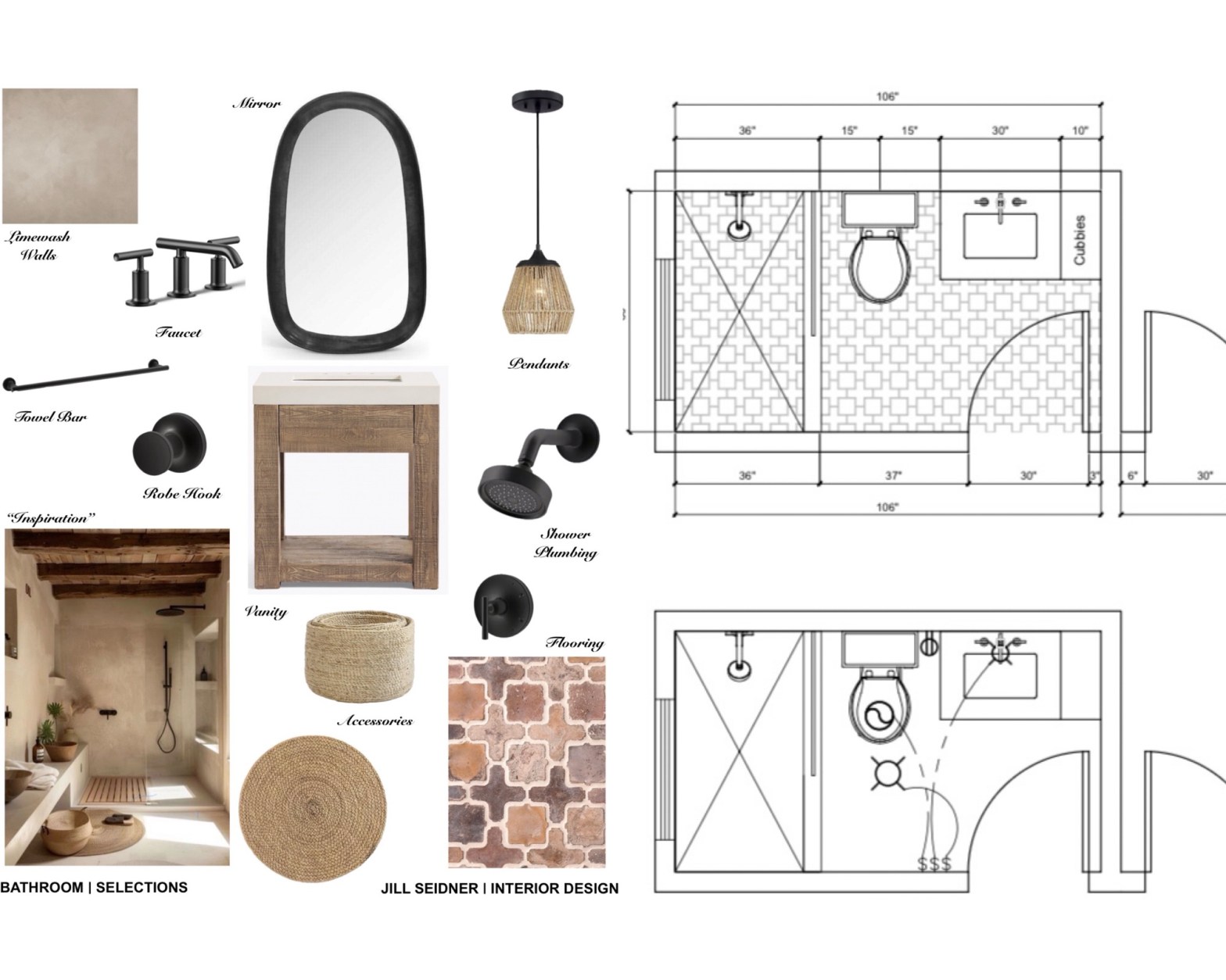
Per her input and inspiration photos, we re-designed the bathroom from the original take on a contemporary Spanish style to a more on-trend natural style.

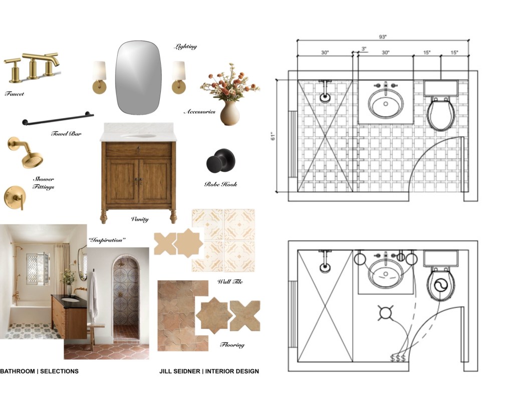
Here’s a look at one bathroom, two ways:

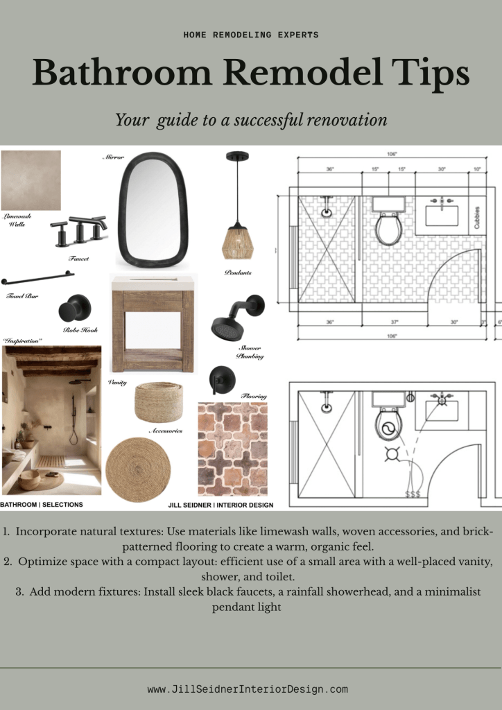
Overall Style:

  • Modern Spanish influence with a mix of traditional and contemporary elements
  • Warm, earthy tones with rustic textures

Key Fixtures & Finishes:

  • Vanity:
    • Warm wood finish with classic legs and cabinet storage
    • Marble countertop
  • Faucet & Shower Fittings:
    • Brushed brass/gold finish
    • Clean-lined, modern profiles
  • Mirror & Lighting:
    • Rounded-edge mirror for a soft modern look
    • Brass wall sconces flanking the mirror
  • Towel Bar & Robe Hook:
    • Matte black finish for contrast
    • Simplistic, functional hardware

Tile Selections:

  • Flooring:
    • Spanish-style terracotta tiles
    • Mix of solid and patterned shapes (cross/star shapes)
  • Wall Tile:
    • Delicate cream and tan patterned tile
    • Soft and subtle design to enhance the Spanish feel

Layout:

  • Efficient, rectangular layout
  • Shower, vanity, and toilet arranged along the long wall
  • Entry door swings inward with clear circulation path
  • Built-in niche or shelving in shower area

Accessories:

  • Neutral-toned ceramic vase with dried florals
  • Accent decor to add warmth and texture

Inspirational Images:

  • Arched doorway with statement tile inlay
  • Wood vanity with bold black countertop and soft neutral backdrop
  • Vintage-inspired but clean and modern execution​

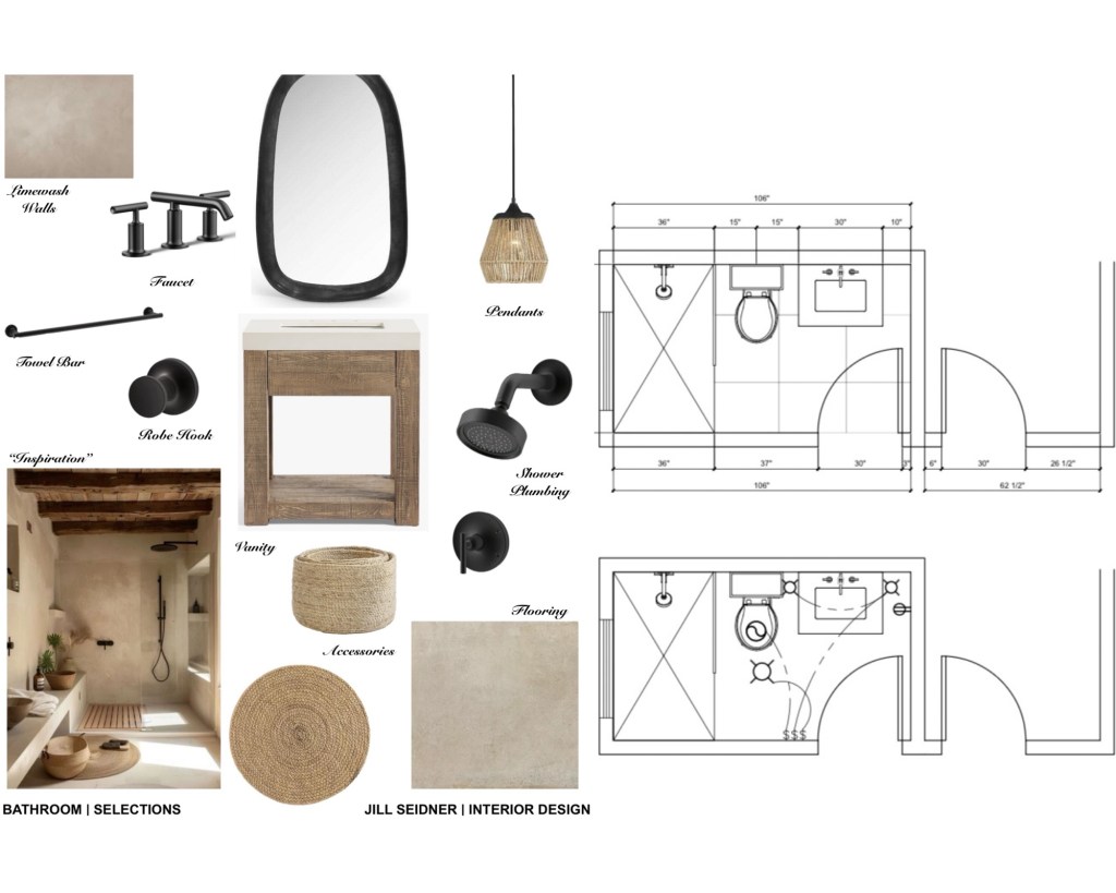
Overall Style:

  • Earthy, organic modern aesthetic
  • Inspired by natural textures and neutral tones
  • Features limewashed walls for a soft, matte, old-world feel
  • Minimalist yet warm and grounded

Key Fixtures & Finishes:

  • Vanity:
    • Rustic wood with open shelf base
    • Simple white sink integrated into top
  • Mirror:
    • Irregular organic shape in a matte black frame
  • Faucet & Shower Plumbing:
    • Matte black fixtures for modern contrast
    • Clean-lined, contemporary silhouettes
  • Lighting:
    • Woven pendant light—adds texture and natural fiber
  • Hardware:
    • Matte black towel bar and robe hook for cohesion

Tile & Surfaces:

  • Walls:
    • Soft limewash finish in warm beige tone
  • Flooring
    • Warm mix of earthy browns and dusty tones
    • Organic shapes with a rustic layout

Accessories:

  • Woven seagrass baskets
  • Round natural fiber mat
  • Decor that adds texture and emphasizes the neutral palette

Layout Highlights:

  • Rectangular bathroom layout
  • Separate shower with glass door
  • Toilet centered between shower and vanity
  • Additional cubbies or shelving for storage near the vanity

Inspiration Image:

  • Spa-like minimalism
  • Built-in ledge for seating and display
  • Streamlined and cohesive neutral palette

We were also able to widen the existing bathroom into the adjacent laundry room (not reflected on the first plan).

Which bathroom do you like better?

For more design advice: https://yourdesignguide.design.blog/