In September, paid subscribers and I worked through the Entry + Living Room for thirty days, one lesson at a time.
October was supposed to be the next room.
Then life happened on my end, and the month got away from me. I’d rather tell you that than pretend the challenge quietly skipped a month.
So here’s what we’re doing instead.
The 5-Day Small Space Refresh Sprint at a glance: five tasks, Monday to Friday.
The 5-Day Small Space Refresh Sprint
Five days. One task a day. Each one takes 15 to 30 minutes, and you don’t need to buy anything.
It’s built for small spaces: a studio, a small living room, a small bedroom, a tiny entry, an apartment where every piece has to earn its place. But every task works in a bigger room too, so if your rooms aren’t small, come anyway.
The schedule
Monday, Day 1: The 20-Minute Edit. Take three things out. Small rooms are almost never missing something. They’re usually holding one or two things too many.
Tuesday, Day 2: Measure the Walkways. The one measurement that decides whether a small room feels cramped, and the one piece I’d move.
Wednesday, Day 3: One Color, Three Repeats. The fastest way I know to make a room look pulled together with what’s already in it.
Thursday, Day 4: Light It Like a Designer. Three lamps, twenty minutes, and the bulb mistake that makes small rooms feel smaller.
Friday, Day 5: Style One Surface and Take the Photo. The finishing step, and the before-and-after.
Every post is free. Every post is short. If you miss a day, catch up on the weekend.
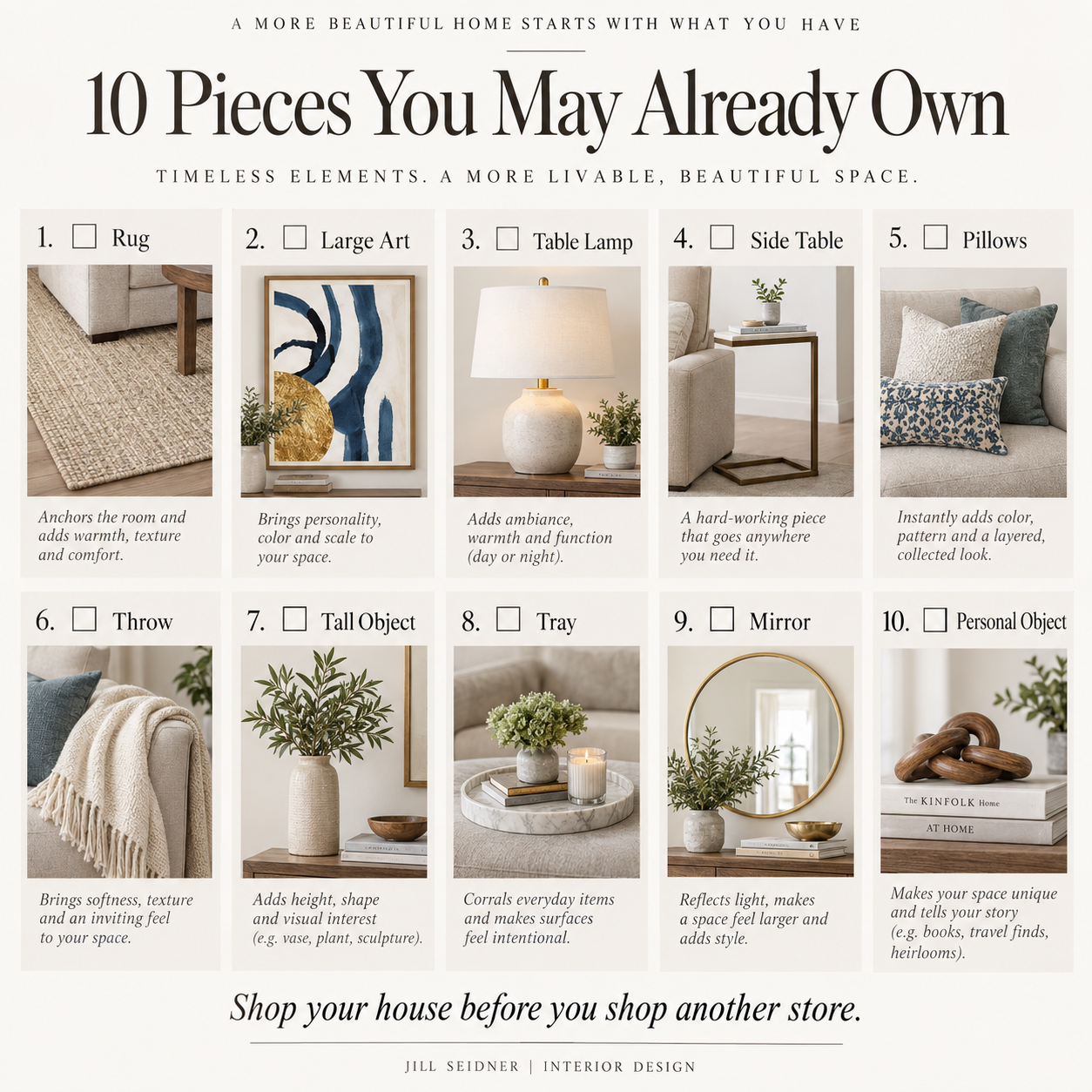
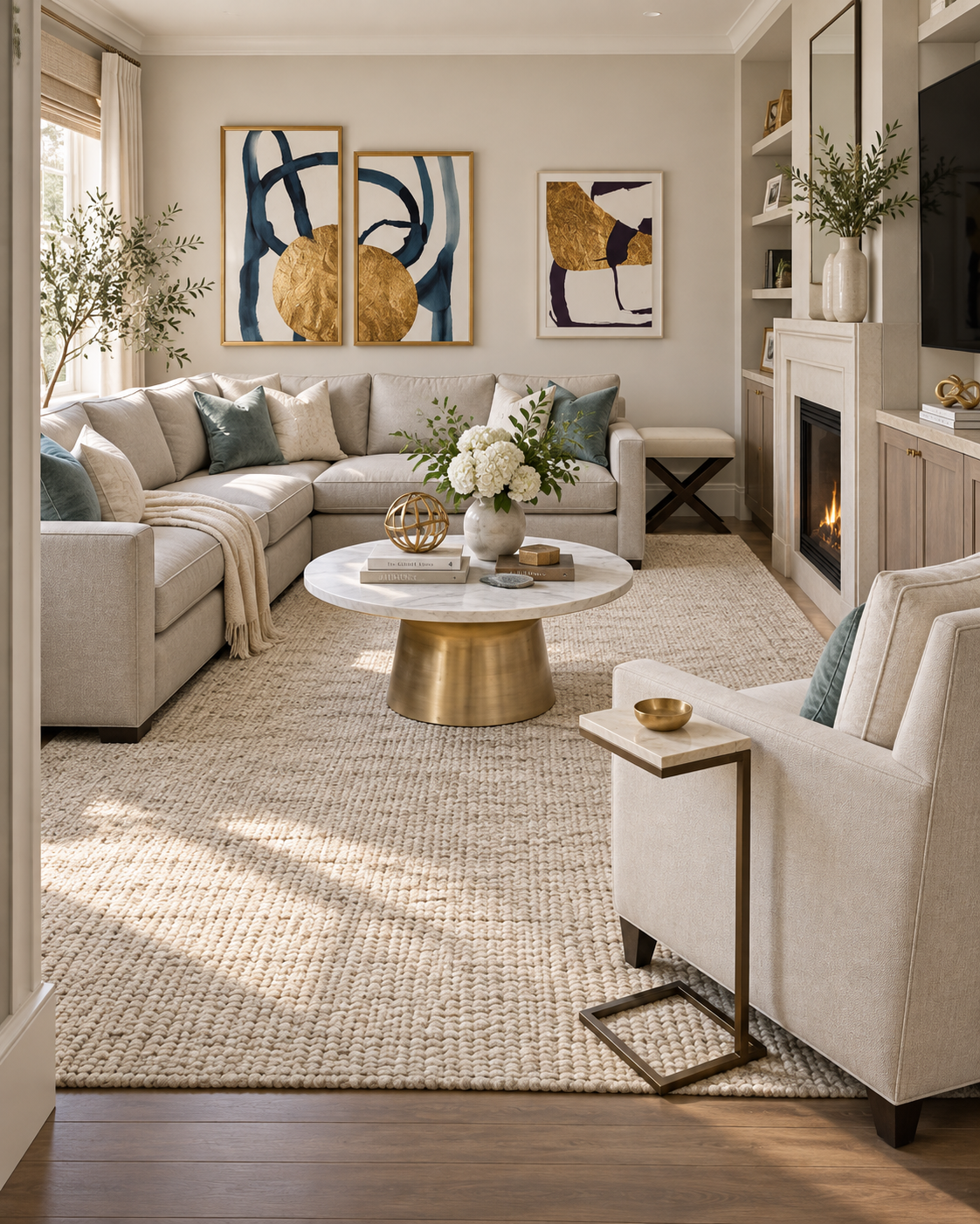
Ten pieces you may already own, planned into a small living room.
Why a sprint, and why free
The 30-day challenges go deep. They’re for paid subscribers and they take a month.
A sprint is the opposite. It’s the five things I’d do in a small room first, before any plan, any budget, any shopping. Most people never get to the plan because the room is too full to see it. The sprint clears that.
It’s also free because I want you to try the way I work before you decide whether the monthly challenge is for you.
How to follow along
Subscribe (free) and the posts land in your inbox Monday through Friday.
Do the task the day you read it. Twenty minutes, not a weekend.
Then come back and tell me in the comments what you moved or took out. I’ll be reading every one.
And on November 1
The monthly room challenges return.
November is Dining Nooks + Dining Rooms, just in time for Thanksgiving and holiday hosting. Thirty days, one lesson a day, for paid subscribers. I’ll share the full plan at the end of the sprint.
If you know someone with a small space
Send them this. The sprint is better with a friend who’s doing it the same week.
Setting up a small space from almost nothing? The Apartment Set Up Guide + Workbook is my step-by-step system: a 30+ page guide, a 40+ page fillable workbook (entry, living room, dining, bedroom, home office, patio, closets) and a budget spreadsheet.
If you’re trying to make a room finally feel pulled together without hiring a full-service designer, you’re in the right place.
I’m Jill Seidner, an interior designer, and Your Design Guide is where I share the practical side of design: what to do, buy, move, change or keep, in the order I’d do it for a client.
Who this is for
You’ve looked around a room and thought, “I know something isn’t right, but I don’t know what to change.”
You keep buying things and the room still doesn’t feel finished.
You want a designer’s process, not another inspiration photo.
You’d rather make the room you have work than start over.
What you get here
Free subscribers get practical interior design advice, room-planning ideas, designer tips, quick fixes, the free sprints and previews of each month’s room challenge.
Paid subscribers get the complete 30-Day Room Redesign Challenge (a new room every month, with daily step-by-step designer direction), every paid post, and The Design Toolkit, my whole library of guides and my course, free with the subscription.
And my free Interior Design Tips guide: 59 pages of room-by-room concept and selection boards from real projects, so you can see how the pieces of a room come together.
Paid subscribers also get my library on one page: The Room Layout Fix course and workbook, the Apartment Set Up Guide + Workbook, my interior design drawings and space planning layouts, The Big Book of Mood Boards and How to Design a Bathroom, plus the full challenge archive, my checklists and the saveable visual guides from paid posts.
At their regular prices, the guides and the course come to $76.96. They’re free with your subscription, and I add a new resource every month.
The free 5-Day Small Space Refresh Sprint. The plan goes up Sunday, October 18, and the five tasks run Monday, October 19 to Friday, October 23: one 15-to-30-minute task a day, and you don’t need to buy anything. Every post is free.
Monthly room challenges are back on November 1 with Dining Nooks + Dining Rooms, just in time for Thanksgiving and holiday hosting.
When you’re ready for the plan, not just the ideas
Paid: $19 a month or $119 a year. The 30-Day Room Redesign Challenge, every paid post and The Design Toolkit. There’s a free trial, so you can try it before you decide.
Founding Design Member: $199 a year. Everything in paid, plus a free one-hour online interior design consultation with me, a $150 value. If you want my eyes on your own room, that’s the one to pick.
Most of what I’ve made for Your Design Guide used to live in different places.
The guides were on Gumroad.
The course was on Gumroad.
The challenge ran as a series of daily posts.
The checklists and visual guides were buried inside paid articles.
So I put all of it here, on one page.
If you’re a paid subscriber, everything on this page is yours. No extra purchase. The guides I sell on Gumroad are free for you here, and I’ll add a new resource every month for as long as you’re subscribed.
If you’re reading this as a free subscriber, this is what paid includes.
In the Toolkit right now:
The Room Layout Fix — my 7-day course and workbook ($27 on Gumroad)
The Apartment Set Up Guide + Workbook — with the budget spreadsheet ($19.99)
Interior Design Drawings + Space Planning Layouts — hundreds of floor plans, elevations and lighting plans ($9.99)
The Big Book of Mood Boards — 100+ boards for every room ($9.99)
How to Design a Bathroom — my step-by-step bathroom guide ($9.99)
The 30-Day Room Redesign Challenge archive — September’s Entry + Living Room challenge, every lesson
My checklists — measuring, editing, the final shopping list, the finishing details
The visual guide library — the saveable graphics from my paid posts, in one place
At their regular Gumroad prices, the five guides and the course come to $76.96. A paid subscription is $19 a month or $119 a year, so the Toolkit alone more than covers your first four months. Everything else on this page is on top of that.
I get the same question every fall: “How do I make my living room feel cozy without it looking like a pile of blankets?”
So this time I did the whole room for you.
Here is a living room I would actually put together for a client who wanted warm, calm and a little bit of fall. Twelve pieces. One palette. Every link in one place.
Why it works
One palette, repeated. Cream, oatmeal, olive and a little brass. The chair, the rug, the pillows and the throw all sit in that family, so the room reads as designed instead of collected. (This is the one-color-three-repeats rule we’ll do together in next week’s free 5-Day Small Space Refresh Sprint, done for you.)
Light at three heights. A gold arc lamp over the seating, a pair of ceramic lamps on the side tables, and daylight. The arc lamp is the piece I’d buy first; it gives you an overhead glow without calling an electrician.
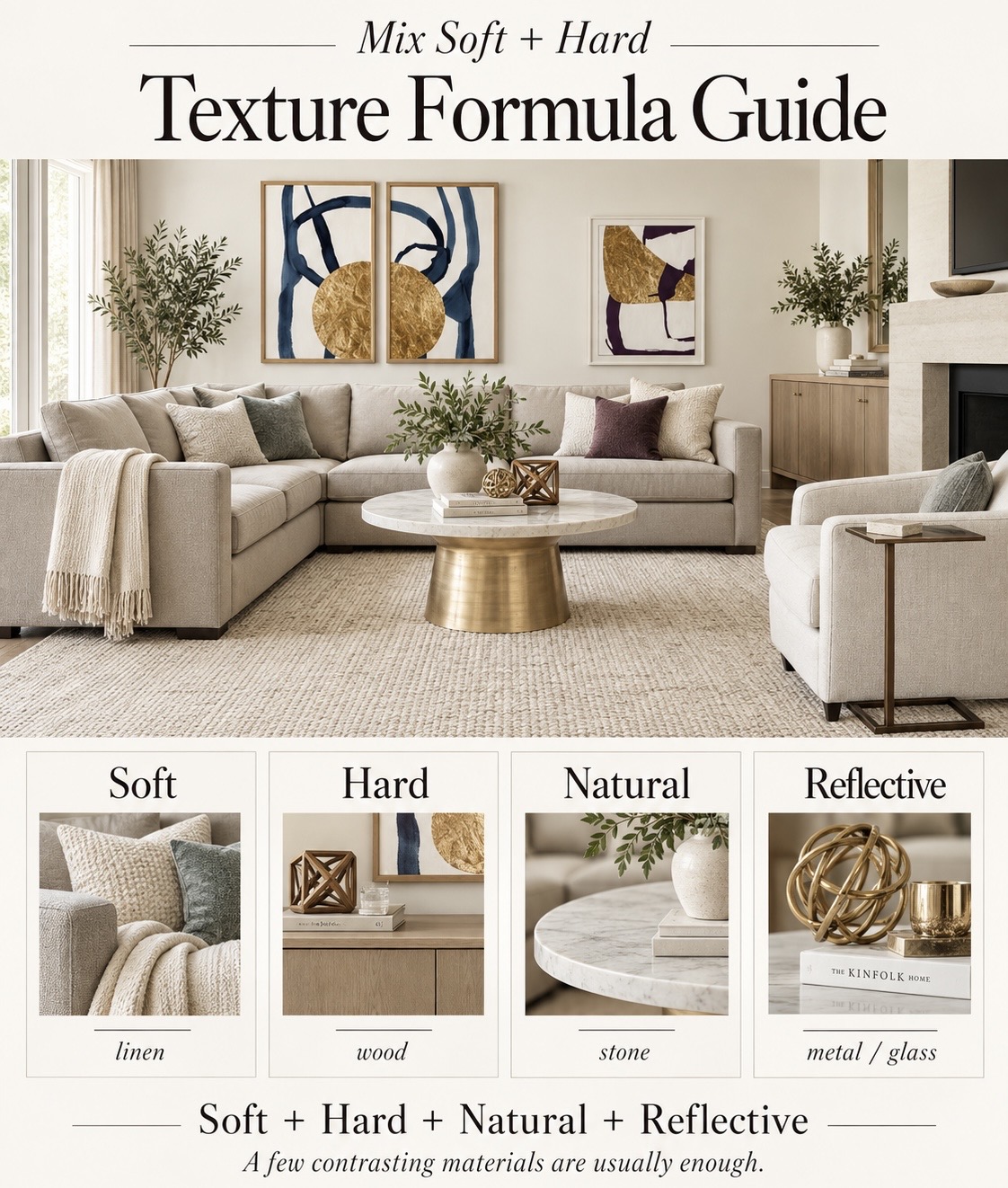
Texture instead of stuff. Boucle on the chair, chenille on the throw, water hyacinth in the baskets, a rug you can wash. The room feels layered with very little on the surfaces.
One tree, one corner. A faux olive tree fills the empty corner every living room has, and it’s the piece people ask about.
The fall part is the easy part. The velvet pumpkins are the only seasonal thing on the board. Put them on the coffee table in October, in a basket in November, away in December. The rest of the room stays.
How to use it
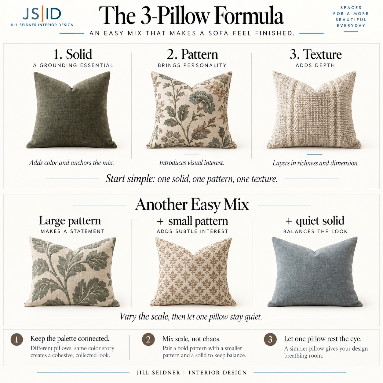
You don’t need all twelve. Start with the three that fix the most: the rug (it sets the palette), the arc lamp (it fixes the light) and the pillows and throw (they tie the sofa you already own to everything else).
Every piece, with prices and links, is on the room page:
If the pieces are right but the room still feels wrong, the problem is usually the layout. Room Layout Fix is my step-by-step guide to measuring, placing and fixing the flow of any room, with the designer measurements I use on every project.
And this is where the project gets interesting: the hallway.
The problem wasn’t really storage
Of course we needed storage.
But simply adding shelves and doors would have solved only half the problem.
These closets sit within the circulation of the house, which means they are constantly visible. They needed to feel like part of the architecture—not like storage units inserted into a hallway as an afterthought.
That changed the entire design approach.
Instead of asking:
How much can we fit inside?
I started with:
What should this look like when all the doors are closed?
That distinction is one of the biggest differences between planning cabinetry and simply buying storage.
The working drawings: plan view plus elevations with hanging, shelf and drawer heights.
Closet No. 1: the larger wardrobe
The first closet is the larger of the two and functions much more like a compact built-in wardrobe.
Inside, I divided the space into separate zones rather than using one continuous hanging rod.
There is long hanging.
Double hanging.
Folded storage.
Shelving.
Drawer storage.
And overhead space for items that aren’t used every day.
It sounds simple, but dividing a closet this way dramatically increases how useful it becomes.
One giant hanging section usually looks spacious on a drawing.
In real life, it can waste a surprising amount of vertical space.
Concept plus drawing on one sheet, so the contractor and I are looking at the same thing.
The exterior was designed very differently.
I wanted the cabinetry to read almost like traditional millwork.
Tall paneled doors create the main body of the closet, while the smaller upper cabinets make use of the height and visually connect the cabinetry to the architecture of the house.
That upper section matters.
Without it, the closet would have stopped abruptly and felt much more like a standard closet enclosure.
With it, the piece becomes part of the room.
Closet No. 2: the linen cabinet
The second closet had a completely different job.
This one needed to hold linens and household storage, so the interior became a combination of adjustable shelving and drawers.
But because it is smaller and narrower, I wanted to give the exterior a little more personality.
That’s where the arched cabinet doors came in.
The arched cabinet, drawn in plan and elevation.
The arch subtly references the architectural vocabulary of a Spanish Revival without turning the cabinet into something overly themed.
That’s an important distinction.
You don’t need every element in a Spanish house to scream Spanish.
Sometimes repeating one shape is enough.
An arch.
A warm plaster tone.
Dark hardware.
A handmade tile.
Those small repetitions are usually what make a renovation feel connected.
The finish was deliberately quiet
For both cabinets, I selected:
Sherwin-Williams SW 7030 Anew Gray
in a satin cabinet finish.
Anew Gray sits somewhere between warm gray, taupe and greige.
It has enough depth to distinguish the cabinetry from the surrounding walls without becoming a dramatic contrast color.
That was important here.
The cabinetry already has architectural detailing.
It didn’t need another competing idea.
The arched cabinet concept: inspiration photo, paint color and hardware together.
One of my favorite design rules is:
If the shape is interesting, the color can be quieter.
And the reverse is also true.
A very simple cabinet can sometimes handle a much stronger color.
Here, the paneling, arches and proportions are doing the work.
Then came the hardware
I paired the cabinetry with dark bronze hardware from RH’s Pillars collection.
The contrast against the muted taupe cabinetry gives the doors just enough definition.
For the larger doors:
RH Pillars Pull — 8” — Bronze
For smaller cabinet doors:
RH Pillars Knob — 1½” — Bronze
[IMAGE: Hardware close-ups]
I especially like the subtle ribbing on these pieces.
They aren’t flashy.
But when you’re standing in front of the cabinetry, the texture adds another layer.
This is the kind of hardware detail I look for repeatedly: something that still feels simple from across the room but gets more interesting as you get closer.
Closet Source List
Save this section if you’re planning custom hallway cabinetry of your own.
Sometimes the sofa is good. The rug works. The coffee table is the right size. You’ve added pillows, books, lamps and a few things you genuinely like.
But somehow the whole room still feels slightly off.
Before you replace furniture or start another round of shopping, look at the styling.
The way you decorate a room should respond to the architecture, furniture shapes, scale and mood that are already there. A low, modern room wants something different from a traditional room with molding. A small living room needs a different styling strategy than a large open-plan space.
And a room filled with substantial furniture usually doesn’t need fifteen more small decorative objects.
Sometimes the room itself is already telling you exactly how it wants to be styled.
The trick is knowing what to look for.
In this guide, we’re matching:
Styling to your furniture scale
Art to your walls and architecture
Accessories to the visual weight of the room
Lighting to the height and shape of your furniture
Décor to modern, traditional and mixed interiors
The amount of styling to the actual size of the space
I’ve also included three saveable designer guides:
GUIDE 1 — Match Your Styling to Your Furniture Scale
A visual comparison showing how light-, medium- and heavy-scale furniture should be styled differently.
GUIDE 2 — Style the Room You Actually Have
A four-room cheat sheet for Modern, Traditional, Old + New and Small Spaces.
GUIDE 3 — When a Room Feels Off, Check This First
A designer checklist for scale, height, shape, texture, art, lighting and empty space.
For the last 28 days, you’ve worked through the Entry + Living Room before buying your way out of the problem.
You’ve looked at layout, flow, scale, lighting, art, rugs, seating, styling and what you already own.
So today, instead of creating a giant wish list, we’re making a short, specific shopping list.
My simple sorting rule before you buy anything: need, nice to have, or don’t buy yet.
Start With the Gaps
Walk through the Entry + Living Room one last time.
Ask:
What is still missing?
What problem has not been solved?
What existing piece truly needs replacing?
What would make the room function better?
Maybe the Entry still needs closed shoe storage.
Maybe the Living Room needs one floor lamp.
Maybe the rug really is too small.
Maybe you discovered you need absolutely nothing.
That counts too.
Before you start adding things to your cart…
There’s one final filter I use to decide whether something belongs on the shopping list at all.
It prevents a lot of expensive “almost right” purchases.
That’s today’s assignment.
Join now and get access to the full 30-Day Entry + Living Room Redesign Challenge.
Founding Members also receive a free 1-hour online interior design consultation for design or remodeling questions, feedback, solutions, ideas and sources.
Living room furnishings: gray cabinet, wood console, leather ottoman and a soft vintage-style rug.Family room furnishings: a deep white sectional, navy accents and a knit pouf.
There’s something about a full-house project that can make people think the first step is to start over.
New furniture. New rugs. New lighting. New everything.
But that usually isn’t where I start.
I start with what’s already there.
That was the approach with this family home. The house already had its own architecture, its own floor plan, and a collection of furnishings that needed to stay. The family also had very clear needs from room to room.
So instead of treating the house like a blank slate, I treated it like a puzzle.
What stays?
What moves?
What’s missing?
What needs to be added?
And how do we make all of those decisions feel connected?
That was the entire project.
The project really started with the floor plan
Before I selected anything new, I worked from the plans of the house.
That gave me the structure.
I could look at circulation, door swings, windows, existing furniture, wall space, and the dimensions available for anything new.
This is one of the most useful parts of the process because it takes a lot of guessing out of decorating.
A sofa can be beautiful and still be wrong for the room.
A console can be the right style and still be six inches too deep.
A rug can look perfect online and completely change the scale of a room once it arrives.
The plan helps answer those questions before you buy.
The entry board next to its plan: a 24 by 12 inch console with a mirror above and a 5 foot round rug.
For the entry, for example, the room didn’t need very much.
It needed a narrow console, a mirror, hooks, a rug and a few accessories.
The challenge was making all of that fit without crowding the front door.
So the floor plan came first, then the furnishings followed.
I wasn’t designing for an imaginary family
That matters.
This wasn’t about creating a beautiful room for a photograph.
It was about creating rooms around the people actually living there.
Each area had a different job.
The entry needed to handle coming and going.
The family room needed comfortable seating and softness.
The living room needed to support both entertaining and everyday use.
The study needed multiple workstations and storage.
And the bedrooms needed to feel individual rather than like variations of the same room.
The more specific the needs became, the easier the design became.
That sounds backwards, but it’s usually true.
When you know exactly what a room has to do, you can stop considering a hundred things that don’t belong there.
Then I worked with what they already owned
This was probably the most important part of the project.
Not everything needed replacing.
And I don’t think a successful redesign requires that.
I looked at the existing pieces first and asked which ones were still doing their job.
If something worked with the floor plan, suited the family and made sense to keep, it stayed.
Then I built the new selections around it.
That’s very different from shopping room by room and hoping everything eventually works together.
The furnishing list became a response to what was missing.
A rug where the seating needed anchoring.
A console where the wall needed function.
Lighting where a room needed another layer.
Storage where the family actually needed it.
Art where the room needed scale or personality.
The project source list shows that same mix across the house: furniture, rugs, lighting, storage, art, pillows, accessories and other pieces were selected room by room instead of treating the house as one giant shopping list.
The family room was more about connection than adding more
Family room board: sectional, navy pillows, art and the rug that ties it together.The family room plan, with the sectional and rug sized to the space.
The family room already had a strong central piece in the sectional.
So rather than overcomplicate it, I built around that.
The rug, art, ottoman, pillows, accessories and greenery were all selected to make the seating area feel more finished.
There’s a lot of blue, gray, warm brown and natural texture in this room.
Not because everything needed to match.
Because repeating a few colors and materials is often enough to make a room feel connected.
That’s one of the easiest design rules to use in your own home.
You don’t need twelve matching pieces.
You need a few repeated ideas.
The living room needed a little more planning
Living room board beside the plan, so every piece has a place.
This space had several functions happening at once.
Seating.
Dining.
Storage.
A console.
A media piece.
And circulation between all of them.
That meant the furniture plan had to do most of the work before I ever thought about styling.
The dining area needed enough room around the table.
The seating needed its own zone.
The perimeter pieces needed to fit without making the room feel lined with furniture.
Once those larger decisions were made, the decorative layer became much easier.
The selected furnishings for this area included a media cabinet, console, side table, rug, art, pillows, greenery and dining pieces, all chosen around the room plan rather than independently.
The study became its own little system
Study: desk, chair, bookcases and a striped rug, laid out for three work spots.
The study was one of the more practical rooms.
It needed to support more than one person.
That immediately changed the design.
Instead of asking, “What desk do I like?” the better question was:
How many workstations need to fit?
Where does storage go?
How much wall space is available?
Where should shelves sit?
What kind of lighting will actually help?
The furnishing plan ultimately included multiple desks, desk chairs, shelving, wall lighting, storage pieces, baskets and a rug.
Once the structure of the room was solved, the style followed naturally.
The bedrooms were where the personalities came through
This is where the house really stopped feeling like one big design project and started feeling like a family home.
Girl’s bedroom: white dresser, a green bench and a playful rug, with the plan.
The girl’s room could carry more color, pattern and softness.
The rug became a strong visual piece.
The bench added another layer of color.
The art and pillows pushed the room a little further without making it overly themed.
The source list included the rug, side table, lamp, dresser, shelving, art, ottoman, pillows and bench as part of that room plan.
Then the boys’ rooms went in completely different directions.
Boy’s bedroom: wood bed, cozy gray chair and navy art, with the plan.Older boy’s bedroom: red storage, black metal shelving and bold art, with the plan.
One became calmer and more understated.
The other used stronger black, red and graphic elements.
And that was exactly the point.
I didn’t want every bedroom to look as though it came from the same catalog page.
I wanted the house to feel connected, but I also wanted the rooms to belong to the people using them.
This is why I like starting with needs instead of style
Style is important.
But it’s usually not the first question I ask.
The first questions are more practical.
What does the room need to do?
What has to stay?
What doesn’t work now?
What are we missing?
What size can it actually be?
Once those are answered, the style decisions get much easier.
You have fewer options to sort through.
And that usually means fewer expensive mistakes.
The full furnishing plan came together piece by piece
By the time the house was planned, the furnishing list covered the entry, bedrooms, family room, living room, study, dining room and additional selections throughout the house.
It wasn’t one giant makeover.
It was a series of smaller decisions that all worked together.
That’s really the part I like most about online design.
You can work from what someone already has.
You can solve the layout first.
You can add what’s actually needed.
And you can do it without turning the project into something much bigger than it needs to be.
If you’re looking at a room and don’t know where to start
Start with the floor plan.
Then look at what you already own.
Then make a very short list of what the room still needs.
That alone will usually tell you far more than another hour of scrolling through furniture.
By Day 28, the big decisions should already be in place.
The layout works.
The rug is right.
The seating makes sense.
The lighting is layered.
The art is hung.
The Entry is functioning better.
Now we’re looking at the small things that make a room feel finished instead of almost finished.
This is less about adding and more about correcting.
A lamp that is slightly too small.
Artwork hung a little too high.
A cord that is suddenly all you can see.
A console that still feels crowded.
A pillow combination that almost works.
A walkway that could use six more inches.
These are tiny adjustments, but they are often where the transformation happens.
Almost finished vs. finished: the last 10 percent is usually in the details.
Walk the Entry First
Start at the front door.
Do not style anything yet.
Just look.
Is the path clear?
Does the Entry surface still have too much on it?
Is there somewhere practical to put keys or mail?
Does the mirror or artwork feel correctly scaled?
Does the lighting feel good at night?
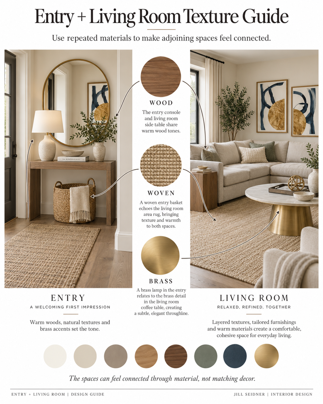
Does the Entry connect visually to the Living Room?
The Entry is your first impression.
It does not need more.
It needs clarity.
Then Walk the Living Room
Look at the room from the doorway.
Then from the sofa.
Then from the opposite corner.
Pay attention to:
art height
lamp scale
furniture spacing
rug placement
curtain length
side table height
coffee table styling
empty corners
visible cords
anything that still feels crowded
This is where photos help again.
A room you live in every day becomes invisible.
A photo gives you fresh eyes.
My room-check order: entry, sofa, windows, art, lighting, surfaces, floor, then the final view.
Look for the Little Annoyances
This is one of my favorite tests.
Ask yourself:
What is the first tiny thing that still bothers me?
Not the biggest design decision.
The tiny one.
That lamp cord.
The crooked frame.
The extra basket.
The chair that still feels too close to the table.
The empty corner you keep trying to solve.
The object you keep moving around because it never feels right.
That is where you start.
Here’s the part most people skip:
They finish decorating and never do the final walkthrough.
But there is a specific checklist I use to catch the things your eye has gotten used to seeing.
It is what I would do at the end of a real design project.
That is today’s challenge.
Join now and you’ll immediately get access to the full 30-Day Entry + Living Room Redesign Challenge, including all previous lessons.
And Founding Members get a free 1-hour online interior design consultation where you can submit your own interior design or remodeling questions for feedback, solutions, ideas and sources.
This is one of the hardest parts of designing your own home.
You get the furniture in place. You add the rug. The lighting improves. The art goes up. The console gets styled. The pillows work.
And then something still feels off.
So the instinct is to add.
Another object.
Another basket.
Another pillow.
Another table.
Another piece of art.
But often the transformation happens when you start taking things away.
Today is about editing the Entry + Living Room so the strongest pieces can finally do their job.
Sometimes the problem isn’t what’s missing. It’s what’s competing.
The Pain Point: Everything Is Fine, But the Room Still Feels Busy
This is incredibly common.
You may like almost everything in the room individually.
But when every wall, table, shelf and corner has something happening, your eye never gets a break.
That is when a room starts feeling busy instead of layered.
The fix is not necessarily minimalism.
It is hierarchy.
Decide what you want people to notice.
Then let the rest support it.
What People Usually Need
Most rooms need fewer competing moments and more breathing room.
One strong piece of art instead of several unrelated pieces.
One useful basket instead of three decorative baskets.
One beautiful object on the coffee table instead of six small accessories.
One lamp that makes a statement instead of several small things fighting around it.
The same applies to the Entry.
If you already have a great mirror, lamp and console, you may not need another stack of books, bowl, candle, plant, tray and framed photo.
A little restraint can make everything you keep look better.
The designer edit: sort every piece into keep, remove or reconsider.
The Transformation
The goal is not to make the room emptier.
When you edit well:
the artwork becomes stronger the furniture feels more intentional the walkway opens up the Entry feels calmer the Living Room feels larger the pieces you love become easier to notice
This is one of those changes that may cost absolutely nothing and still make the room feel much more finished.
Before we get into today’s assignment…
I want to know where we should go next.
What room should the next 30-Day Challenge cover?
Kitchen? Bedroom? Dining Room? Bathroom? Home Office?
Leave your vote in the comments.
I’m building the next challenge around what you actually want help with.
Here’s the editing test I use when I know a room is almost there—but not quite.
Instead of asking, “What else does this room need?”
I ask a completely different question.
And it usually shows me what needs to change within a few minutes.
That is today’s assignment.
Join now and you’ll immediately get access to the full 30-Day Entry + Living Room Redesign Challenge, including all previous lessons.
And Founding Members also get a free 1-hour online interior design consultation with me.
You can submit your own interior design or remodeling questions and use the consultation for designer feedback on things like:
layout
furniture placement
paint + finishes
kitchen or bathroom decisions
lighting
materials
product sources
styling
“Which option should I choose?”
“Why isn’t this room working?”
Bring the room, the problem or the decision you’re stuck on, and we’ll work through solutions and ideas together.
5 Furniture + Decor Pairings That Always Make a Room Look Put Together
A room gets considerably easier to decorate once you stop looking at every piece individually.
A sofa can be beautiful and still feel wrong with the rug underneath it. A console can look too bare with one tiny lamp. A bed can have great bedding and still feel unfinished because nothing around it has enough scale.
The pieces have to work together.
And that usually comes down to proportion, height, texture and contrast—not filling the room with more things.
Dark sofa, warm wood and a leather chair: a pairing that always works.
In this article, you’ll get:
5 furniture-and-decor formulas that make rooms easier to finish
15 room ideas showing different ways to use the combinations
The designer reason each pairing works, so you can recreate it with pieces you already own
Simple size + proportion rules for rugs, art, lighting and furniture
4 saveable visual guides you can come back to when you’re decorating
Think of this as your cheat sheet for knowing what to put with the furniture you already have.
Your room may not need more furniture. It may just need the right pieces paired together.
Paid subscribers get the complete guide, designer formulas, measurements and all four saveable cheat sheets below.
My idea of a good room isn’t one filled with more stuff. It’s a room with a few pieces doing the right jobs: a properly scaled rug, good lighting, something substantial on the wall, and enough texture that the space doesn’t feel flat.
Seems reasonable, right? Until you start shopping and suddenly every website is convincing you that you need another vase, another basket, another tiny accent table and twelve decorative objects.
For this edit, I wanted to bring it back to the pieces that actually make a room work.
The good part is that you may already own many of them. Move the lamp. Change the pillow combination. Add a larger piece of art. Pull the rug farther underneath the furniture. Sometimes the room doesn’t need a redesign. It needs a better edit.
Below, we’re getting into ten pieces I return to consistently, how I use each one, and the small details that make them look more considered.
I’ve also included four visual guides:
10 Pieces You May Already Own — what to pull from other rooms before buying anything new.
The Designer Layering Formula — Rug + Furniture + Lighting + Art + Textile + Object.
5 Room Formulas to Copy — simple combinations for living rooms, bedrooms and entries.
The Little Styling Upgrades — small before-and-after adjustments that immediately make a room look better.
Today we’re working on lighting for the Entry + Living Room.
This is one of the fastest ways to change how a space feels without changing the furniture.
The mistake is relying on one overhead fixture to do everything.
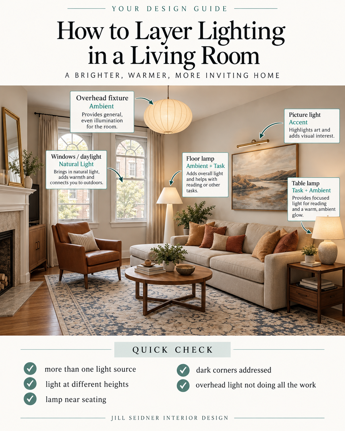
Good lighting usually comes from layers. (Overhead light, Table lamps, Floor lamps, Accent lighting.)
And in the Entry, sometimes one well-placed lamp changes the whole mood.
⸻
Start With the Living Room
Think about how the room works during the day versus at night.
During the day, natural light may do most of the work.
At night, you need other sources.
A floor lamp can soften a dark corner.
A table lamp makes a seating area feel more inviting.
A picture light or small accent light can bring attention to art or shelving.
The goal is not to make the room brighter everywhere.
It’s to make the light feel balanced.
How to layer lighting: ambient, task and accent, each at a different height.
⸻
Then Look at the Entry
The Entry often gets overlooked.
It may have one ceiling fixture and nothing else.
But this is the first space you see when you come home.
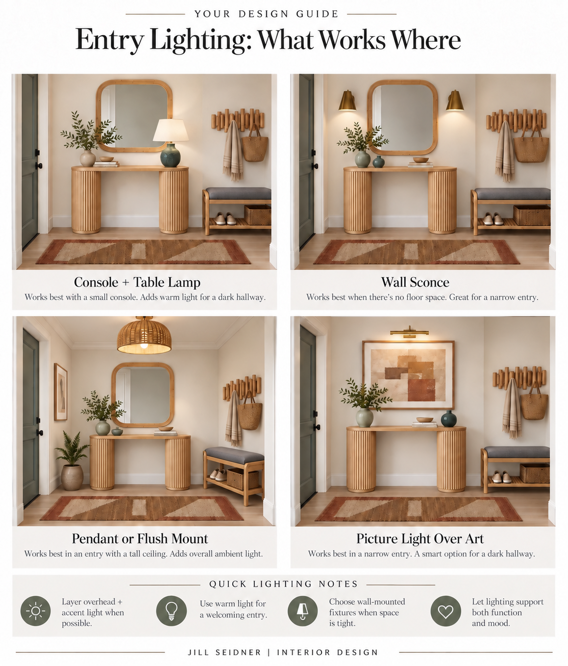
If you have a console, try adding a lamp.
If the Entry is small, a wall sconce can work beautifully.
If there’s no surface at all, even changing the overhead fixture can make the space feel much more finished.
Lighting is especially useful here because the Entry does not need a lot of furniture to have presence.
Entry lighting, what works where: table lamp, sconce, pendant or a picture light.
⸻
Think in Layers
A simple lighting plan usually includes three types:
Ambient lighting
The general light in the room.
Task lighting
Light for reading, working or anything you actually need to see.
Accent lighting
Light that highlights art, architecture or a specific area.
You do not need all three in every corner.
But your Living Room should usually have more than one source of light.
And your Entry should have at least one source that feels inviting when the overhead light is off.
⸻
Today’s challenge is about figuring out where your room actually needs light — not just adding another lamp.
Paid subscribers get the full 30-Day Room Redesign Challenge with daily assignments, designer guidance and step-by-step help for the Entry + Living Room.
A beautiful kitchen can still be frustrating to live in.
The refrigerator can be too far from the prep area. The dishwasher can collide with an open drawer. The island can look perfect in a rendering and leave barely enough room to walk around it.
That’s why I don’t start a kitchen with finishes.
I start with the plan.
A kitchen plan is really a map of how the room needs to work: where you enter, where you unload groceries, where you prep, where you cook, where you wash dishes, where you make coffee—and, in this project, where you make a drink.
The kitchen plan: island, work zones and the dining table all drawn to scale.
The complete kitchen, living, utility and bar plan. Before elevations and finishes, I work out how all of the spaces connect.
This custom kitchen is a good example because it isn’t just one wall of cabinetry.
There is a 17’-6” main kitchen wall, a large working island, separate refrigerator and freezer, pantry storage, utility cabinetry and a dedicated wet bar.
Everything needed its own purpose without making the entire space feel like one enormous kitchen.
And that takes more planning than people realize.
First: I Design the Entire Room, Not Just the Cabinets
One of the easiest mistakes to make is designing a kitchen elevation without looking at what is happening around it.
The floor plan comes first.
I’m checking circulation from the adjoining rooms, distance between the island and perimeter cabinetry, appliance locations, pantry access, seating, sink placement and storage.
The kitchen might occupy one section of the room, but it affects everything around it.
A refrigerator door opening into the wrong path can change the entire experience of the space.
A four-inch shift in an island can matter.
Kitchen design is often less about finding more room and more about using the inches you already have better.
Then I Break the Kitchen Into Work Zones
Forget the old kitchen triangle for a moment.
I usually think in zones instead.
There is a refrigeration zone, prep zone, cooking zone, cleanup zone, pantry zone and serving zone.
In this kitchen, the refrigerator and freezer sit along the secondary wall while the cooking area becomes the visual center of the main elevation.
The island handles another layer of work, including the sink, dishwasher and generous counter space.
That separation keeps several people from needing to stand in exactly the same place.
A quick kitchen test
Stand in the middle of your kitchen and ask:
Where do I put groceries down?
Where do I chop vegetables?
Where do dirty dishes collect?
Where is the trash?
Can someone open the refrigerator while someone else is cooking?
Those five questions will tell you a lot about whether your kitchen actually works.
Cabinet elevations: pantry, bar, island and the oven wall, each drawn out.
Elevations let me test proportions that a floor plan can’t show—cabinet heights, appliance placement, backsplash, hood and the relationship between upper and lower cabinetry.
The Elevations Are Where the Kitchen Starts Becoming Real
Once the floor plan works, I draw the walls vertically.
This is when you begin seeing the architecture of the kitchen.
On the main wall, the range and hood become the center point, with cabinetry balancing either side.
The elevation also tells me whether a cabinet needs to be 18 inches wide or 24. Whether an upper cabinet looks awkward. Whether the backsplash should continue. Whether the hood is properly proportioned to the wall.
These aren’t just decorative decisions.
They determine whether the finished kitchen feels calm or slightly off.
And “slightly off” is usually what people are describing when they tell me they like their kitchen, but something about it doesn’t look right.
Often, it’s proportion.
Cabinet Rhythm Matters More Than You Think
Look carefully at a well-designed kitchen and you’ll notice something you may not consciously register:
Rhythm.
Drawer widths relate to one another.
Upper cabinets align with base cabinets when possible.
Appliances don’t look randomly dropped into the elevation.
Vertical lines make sense.
That doesn’t mean everything has to be perfectly symmetrical. It means there needs to be a visual reason for where things begin and end.
Even the smallest filler panel can affect that.
Want the Actual Planning Details Behind This Kitchen?
Below, I’m breaking down the measurements I watch, how I plan storage, why the refrigerator and freezer were separated, how I approached the island—and the small wet bar that became one of my favorite parts of the project.
Subscribe to continue reading + get the designer planning guides, layouts, checklists and sourcebooks I share with paid subscribers.
Founding Members also receive a 1-hour online interior design consultation with me—a $150 value.
A living room can have a good sofa, beautiful chairs and plenty of space—and still feel wrong.
Usually the problem isn’t the furniture itself.
It’s how much seating there is, where it sits, and what each piece is actually doing.
Yesterday we used the rug to anchor the room. Today we’re building the seating around it.
And this is one area where adding more furniture is very often not the answer.
How much seating do you need, where should it go, and are your current pieces working?
Start With How You Really Live
Before thinking about what a living room is “supposed” to have, think about your household.
If two people use the room every day, you probably don’t need permanent seating for eight.
If you entertain occasionally, that doesn’t automatically mean you need another full-size chair taking up space every day.
Flexible pieces can do a lot:
A bench.
Two small ottomans.
A lightweight accent chair.
A stool that can move when needed.
The room should work beautifully on an ordinary Tuesday, not just for the occasional gathering.
Core living room pieces first, then the helpful additions.
This is especially important in smaller rooms. Instead of filling every available corner, think about pieces that can move and do more than one job.
The Sofa Is Usually the Anchor — But It Doesn’t Have to Hug the Wall
One of the first things I look at is sofa placement.
Does it face the TV, fireplace, view or other focal point?
Does it leave a comfortable circulation path?
Is it scaled appropriately for the room?
And could it come off the wall?
We tend to push furniture against walls because it feels like that will make the room larger.
Sometimes it does the opposite.
Pulling the seating inward—even a little—can create a much more connected conversation area.
Five ways to fix an awkward living room layout.
Notice how the sofa, chairs, rug and coffee table work as a group.
That relationship matters more than whether every wall has something against it.
Your Chairs Should Have a Reason to Be There
An accent chair shouldn’t exist simply because there’s an empty corner.
Ask what it does.
Does it complete the conversation area?
Provide a good place to read?
Turn toward the television?
Balance the sofa?
If not, you may not need it.
Two chairs can create beautiful balance in a larger room. One flexible chair may be better in a smaller one.
And if the room has no obvious focal point, the seating itself can create one.
Layout options for small spaces: four ways to arrange seating.
Instead of orienting everything toward a fireplace or TV, arrange the sofa and chairs around the rug and coffee table.
Now the conversation area becomes the focal point.
Your Entry Needs Seating Too—Sometimes
Don’t forget the Entry.
Not every entry needs a bench.
But if you regularly sit to put on shoes, set down a bag or need a landing spot near the door, a slim bench, stool or small ottoman can be incredibly useful.
The important word is useful.
If the bench makes the Entry harder to walk through, it isn’t helping.
This is where yesterday’s circulation lesson comes back in: function first, then styling.
A Few Seating Rules Worth Keeping
You don’t need to memorize dozens of measurements, but these are good starting points.
Keep your main circulation paths around 30–36 inches when the room allows.
Keep the coffee table around 14–18 inches from the sofa so it’s close enough to use without feeling cramped.
Use the rug to visually connect the main seating pieces.
And whenever possible, arrange seating close enough that people can comfortably talk without shouting across the room.
Three seating configurations that work for TV and conversation.
If television is important in your room, remember that you don’t have to sacrifice conversation for TV viewing. Swivel chairs, angled chairs and flexible seating can give you both.
But before you buy another chair…
There’s a quick exercise I use to determine whether a room actually needs more seating—or whether the furniture that’s already there simply needs to be rearranged.
You can have the sofa, the rug, the coffee table and the lamps—and still look around the room thinking:
Why doesn’t this feel finished?
Usually, it isn’t because you need completely different furniture.
It’s the last layer.
The scale of the lamp. The height of the art. The pillow that connects two colors. The empty corner that actually needs something—or the corner with three things when it needs none.
These smaller decisions are often what take a room from furnished to finished.
And once you understand what you’re looking for, it becomes much easier to work with pieces you already own instead of continually buying more.
A few rooms from one small apartment project, before the finishing touches.
Inside this guide, I’m breaking down:
6 finishing layers I check in almost every room
Easy combinations for pillows, rugs, art and accessories
How to tell when a room needs something added—or removed
The little scale mistakes that can make an otherwise good room feel off
Quick fixes you can make without replacing all your furniture
1. Start With the Pieces That Connect the Room
A finished room doesn’t mean everything matches.
Actually, I usually don’t want everything to match.
What I do want is connection.
Maybe the rust color in a rug shows up again in a pillow.
The black frame around the artwork relates to the black lamp across the room.
The warm wood coffee table relates to a smaller wood accessory on the bookshelf.
You’re looking for little visual threads that move your eye around the room.
They don’t have to be obvious.
They just need to be there.
Art, a stack of books and one small object: the finishing touch on a console.
The floor plans are done, the direction is established, and I’ve started turning those plans into actual rooms.
The Living Room Needed More Than a Sofa
His sofa gave me a starting point, but the rest of the living and dining area was essentially open.
Once I knew the layout, I could start filling in the missing pieces: the rug, coffee table, media cabinet, chair, dining table, console, bench, and lighting.
I kept the furniture warm and modern with walnut, cream, charcoal, rust, and olive.
There’s a little mid-century influence, but I didn’t want the apartment to feel like a themed mid-century space.
The furniture needed to create the background.
His art, books, music, and personal pieces are what will eventually give it character.
The Guest Room Became the Fun Room
This was never going to be a bedroom that just waited around for visitors.
My client loves chess and music, so I wanted this room to actually give him another space to use.
The twin daybed with trundle handles overnight guests without taking over the room.
Then I added a chair, chess table, media cabinet, rug, and side table.
Now it can be a guest bedroom, chess room, music room, or simply another place to hang out.
I like rooms that earn their square footage.
The Main Bedroom Needed to Get Quieter
The bedroom went in a different direction.
After bringing more personality and activity into the other rooms, I wanted this one to feel calmer.
I used warm walnut furniture, cream, olive bedding, black accents, and greenery.
There’s still character, but fewer competing elements.
It feels connected to the rest of the apartment without repeating it.
This Is Why I Don’t Start With Shopping
It’s really easy to look at an empty apartment and immediately start ordering furniture.
Bed.
Nightstands.
Dining table.
Rug.
Chair.
And suddenly you have a lot of perfectly nice pieces that may or may not make sense together.
I work in the opposite order.
Layout first.
Then concept.
Then furniture.
Then the layers that make the room personal.
The floor plan tells me what we need. The furniture boards let me see whether everything works together before the client starts buying.
And now this apartment is starting to look much more like a home than an empty rental.
BONUS: A Done-for-You Bedroom Design
I thought it would be fun to take the main bedroom one step further.
If you like this look, I’ve pulled together the actual pieces I used to create the direction.
You’ve spent the first week figuring out what you have, what works, what needs to move and how the rooms should function.
Now we can start building the actual design.
Today is about color.
Not picking one paint color.
Creating a color story that can carry through both the Entry and Living Room so the spaces feel connected.
That might mean warm neutrals with rust and olive.
Soft whites with black and natural wood.
Cream, blue and brass.
Or something more colorful.
The point is to choose a small group of colors you can keep referring back to as we make decisions.
What We’re Looking At Today
Look back at:
your inspiration images
the pieces you’re keeping
your flooring
your existing paint
art you love
rugs or upholstery that are staying
wood tones
metals already in the room
You are not starting from zero.
Your color palette should work with what is already there.
For the Entry + Living Room, I usually like to think in terms of:
1 main neutral Your walls or largest background color.
1–2 supporting colors These may show up in upholstery, rugs, art or pillows.
1 accent color Something you use in smaller doses.
Your existing finishes Wood, black, brass, chrome, stone, etc.
Ready to build a color palette that actually works with your home?
Paid subscribers get the full 30-Day Room Redesign Challenge, including daily assignments, designer guidance and step-by-step help for the Entry + Living Room.
A few days ago I shared that this 1920s Spanish Revival project is finally getting close to the finish line.
The bathrooms are finished. The laundry room is done. We’re working through the exterior, patio and those last decisions that always seem to take a renovation from almost finished to actually finished.
And then we added another project.
The garage.
More specifically: a home gym + spa.
One More Space to Figure Out
This is actually one of my favorite parts of working on a house over time.
You live with the plans for a while. Rooms get completed. The client starts using the house differently. And sometimes another space suddenly has a much clearer purpose.
The garage was one of those spaces.
Rather than keeping it as a basic garage or creating a workout room that felt completely separate from the rest of the house, we started looking at it as an extension of everything we’ve already been doing here.
A place to work out, yes.
But also storage, recovery and some of the practical things the house still needed.
The list quickly became:
A dedicated workout area
Storage for weights and gym equipment
A sauna
Additional closed storage
An extra refrigerator
A smaller beverage refrigerator
A bench
Good lighting
Enough open floor area that the room still feels comfortable
Quite a bit for a converted garage.
Which meant I went back to the same place I start almost every design problem: the floor plan.
Making the Garage Work First
Before thinking about finishes, I needed to make sure everything actually fit.
The exercise equipment needs open space around it. The sauna takes up a significant footprint. The refrigerators and storage need to be accessible without making the room feel like a utility space.
And there still needs to be room to move.
The plan gives each function its own area while keeping a large portion of the center of the room open for working out.
Along one wall, we have the larger storage pieces, refrigerator and equipment.
The sauna sits toward the opposite end, with a bench nearby.
And then the front wall became the opportunity to make all of those practical requirements feel like an actual room.
Turning Gym Storage Into Part of the Design
I didn’t want a wall of random gym equipment and appliances.
So the elevation became a combination of white oak cabinetry, slatted wood paneling, open shelving, weight storage and refrigeration.
The mirror gives the gym a practical workout function but also helps visually open the room.
The dumbbells and kettlebells become part of the composition rather than something we’re trying to hide.
Then the vertical wood slats tie everything together and give us a place to integrate soft lighting.
The sauna continues the warm wood tones, which is what started pushing the room away from feeling like a converted garage and toward something much calmer.
Almost part gym, part wellness room.
Keeping It Connected to the Spanish House
The interesting part of designing this space was deciding how much it should relate to the original 1920s architecture.
I didn’t want to force traditional Spanish details into a modern home gym.
Instead, I’m carrying over the things that already make sense in this house: warm natural materials, plaster-like walls, earthy colors and darker metal accents.
The palette is very simple:
Warm white.
Sand.
White oak.
Greige.
Matte black.
And a light concrete-look floor.
It feels quieter than the rest of the house, but it doesn’t feel disconnected from it.
And Apparently We’re Still Not Done
That’s the funny thing about long renovations.
You think you’ve reached the final phase and then another room makes its way onto the drawing board.
But I actually think this addition makes sense now.
After almost two years of designing this home, we know what the house needs and how my clients really use it. Instead of designing a garage in isolation, we’re designing it as one more piece of the larger project.
And this may end up being one of the biggest transformations of all.
From garage…
to gym, storage room, beverage station and little home spa.
Not a bad final addition.
Catch up on the rest of this 1920s Spanish Revival project:
You’ve spent the last six days looking at your Entry + Living Room differently.
You’ve analyzed what feels off, found your design direction, shopped your own home, measured, worked through the layout and checked the flow.
Now it’s time to edit.
Because sometimes the room doesn’t need another piece.
It needs fewer pieces competing for attention.
Today we’re deciding what stays, what moves, what can go somewhere else, and what you’re ready to let go of.
What We’re Looking At Today
Walk through the Entry + Living Room and look at each piece with fresh eyes.
Ask:
Does this still work for how I use the room?
Is the scale right?
Does it fit the design direction I chose?
Is it helping the room or just filling space?
Could it work better in another room?
Am I keeping it because I like it, or because it’s always been there?
You do not need to get rid of everything that isn’t perfect.
This challenge is still about working with what you already have.
But keeping something just because it exists is not the same as making it part of the plan.
Ready to edit your room like a designer?
Paid subscribers get the full 30-Day Room Redesign Challenge, including daily assignments, layout guidance, designer rules and step-by-step help for the Entry + Living
There’s something I really like about a project that starts with almost nothing.
My new client is an attorney who rented an apartment only about an eight-minute walk from work. He was basically starting with a sofa, a bed, and a collection of art and interests that gave me plenty to work with.
He used to play professional chess, studied music, loves his guitar, and is originally from Kansas, so prairie imagery and art tied to that part of his life already had meaning.
That became the starting point.
Instead of trying to invent a style for him, I wanted the apartment to feel collected around who he already is.
Warm. Modern. Comfortable. A little mid-century. Layered with music, chess, art, books, and pieces that feel personal rather than overly decorated.
I Started With the Floor Plans
Before shopping, I worked through the layouts.
That tells me what actually fits, what each room needs, and what we don’t need to buy.
In the main living space, his existing sofa became the anchor. From there, I planned the rug, coffee table, lounge chair, dining area, media storage, and circulation through the room.
The goal is to make the apartment feel furnished without making it feel full.
Once the layout was working, I could move into the overall design direction.
The palette is warm walnut, cream, charcoal, slate blue, terracotta, and olive/sage.
There’s a mid-century influence, but I don’t want it to become a theme. The same goes for the music and chess references.
Those things should show up naturally through his art, guitar, chess table, books, and accessories.
The Guest Room Is Also a Chess + Music Room
The second bedroom became one of the more interesting spaces.
Instead of setting it up as a traditional guest room that sits empty most of the time, I planned it around a daybed, lounge chair, media cabinet, guitar, and a 24” x 24” chess table.
It can function as a guest room when needed, but day to day it gives him another place to relax, play chess, listen to music, and display some of his more personal art.
That feels much more useful.
The Bedroom Is Quieter
The primary bedroom is a little calmer.
We’re starting with his existing bed and adding the rug, nightstands, dresser, lighting, and artwork around it.
The wheat artwork will go above the bed, bringing in that Kansas prairie connection in a subtle way.
I like using personal pieces this way. They don’t have to dictate the entire room. They just need to belong there.
Now I’m Moving Into Selections
With the layouts and concept direction in place, I’m moving into furniture, rugs, lighting, storage, and the smaller pieces that will connect everything.
Starting with only a sofa and a bed actually makes the process pretty clear.
We know what stays. We plan the rooms. We identify what’s missing. Then we shop.
The challenge is making sure a mostly new apartment doesn’t look like everything was bought at once.
That’s where his existing art, music, chess, books, and personal history come in.
Those are the pieces that will make it feel like his home.
I’ll share more as the project comes together.
If you like seeing how I plan real client spaces from the beginning, I share more of the step-by-step design process, layouts, sourcing, and room-by-room guidance with paid subscribers.
Upgrade to paid to follow along with more real projects, design guidance, and the 30-Day Room Redesign Challenge.
Paid subscribers get the full 30-Day Room Redesign Challenge, including daily assignments, layout guidance, designer rules and practical room-planning help.
When I first started working on this 1920s Spanish Revival house almost two years ago, we knew it wasn’t going to be a quick cosmetic project.
There were bathrooms to rethink, a laundry room to redesign, finishes to select, architectural details to preserve and quite a few decisions that changed as construction moved along. The goal was always to make the house function better for the way my clients live now without stripping away what made the house special in the first place.
And after nearly two years of drawings, samples, revisions, construction dust and a lot of decisions, we are finally getting very close to the finish line.
We’ve already completed several of the interior spaces, and I’ve shared quite a bit of the design process along the way.
If you want to catch up on the project, start here:
One of the things I’ve been very careful about throughout this house is making sure the new finishes don’t feel too new.
With a 1920s Spanish Revival, I don’t want the exterior to look like someone simply added a collection of trendy Mediterranean materials. I want the pieces to feel like they could have evolved with the house over time.
That has meant working within a fairly restrained palette: warm stucco, dark bronze and brown accents, terra-cotta tones, natural wood, aged-looking tile and lots of texture.
The exterior stucco is Sherwin-Williams Greek Villa, which gives us a warm off-white backdrop rather than a stark white. For the darker trim we selected Sherwin-Williams Black Fox, a brown-black that feels much softer against the terra-cotta roof and wood than a true black would.
And then we started layering in the materials that give the exterior its personality.
The patio became its own design project
The exterior patio and landscape plan have probably involved almost as many decisions as one of the interior rooms.
We’re using warm terra-cotta-inspired tile for the outdoor kitchen and deck areas, along with gravel, concrete slabs and planting to keep the yard from feeling like one large hardscape.
I especially wanted the materials to transition naturally from one area to another rather than having every surface match.
The hexagon tile introduces one shape, the arabesque tile another, and the decorative stair risers give us an opportunity to bring in a little more pattern without covering an entire floor in it.
That combination is very Spanish Revival to me: simple surfaces interrupted by a few really beautiful details.
The detail I keep coming back to: the gates
We’re also doing custom arched wood gates, and they’re one of those features that can completely change how the property feels.
Instead of treating them as a purely functional element, we’re using the gate as another architectural moment — warm natural wood inside the white stucco arch with metal detailing adding just enough contrast.
It’s a relatively small part of the overall renovation, but those are often the details that make an older house feel considered rather than remodeled.
And now we’re down to the garage doors
Which brings us to one of the last exterior decisions.
We’re currently deciding between two garage-door directions.
One is lighter and more naturally weathered, which relates beautifully to the lighter wood gates and gives the exterior a softer, more relaxed California feel.
The other is a darker stained wood door, which creates more contrast against the Greek Villa stucco and feels a little richer and more traditional.
This is exactly the kind of decision I like to make toward the end of a project rather than at the very beginning.
Once the stucco, roof tile, hardscape, gates and landscaping are established, it becomes much easier to see what the house actually needs.
Which would you choose: the lighter weathered wood or the darker stained wood?
Paid subscribers get the full 30-Day Room Redesign Challenge, including the daily assignments, designer measurements, layout guidance and step-by-step help.
There’s a point I see all the time with living rooms.
The sofa is there. There’s a rug. You have a coffee table, art, lighting and maybe even a few really good accessories.
But somehow the room still doesn’t feel pulled together.
Usually, the first instinct is to shop.
Another lamp. Different pillows. A new chair. More art.
But when a room feels “off,” the problem is rarely that you don’t own enough things.
It’s usually that one of the basic parts of the room isn’t working.
When I walk into a living room that feels unfinished, awkward or just not quite right, these are the seven things I check first.
1. The furniture layout
Before I look at color, pillows or accessories, I look at the floor plan.
Does the room have a clear furniture arrangement?
Can you move through it easily?
Is the seating actually arranged for conversation, TV watching or however the room is used?
A beautiful sofa in the wrong place can make the entire room feel awkward.
One of the reasons I start almost every project with a furniture layout is that it gives everything else a place to go.
I almost always start with the layout before making furniture or decorating decisions.
2. The scale of the furniture
Sometimes every individual piece is attractive, but they don’t look right together.
A tiny coffee table with an oversized sectional.
Two delicate chairs next to a heavy sofa.
A console that is much too short for the wall.
Scale is one of those things that can be hard to identify when you’re standing in your own room every day, but once it’s corrected, the whole room starts to make more sense.
And bigger isn’t necessarily worse.
In fact, rooms often feel more polished with fewer pieces at the right scale rather than lots of smaller furniture trying to fill the space.
3. The rug
The rug is one of the first things I notice because it visually connects the seating area.
If it’s too small, the furniture can look like it’s floating around the room instead of belonging together.
Ideally, the rug should relate to the entire seating arrangement—not just sit underneath the coffee table.
Before replacing the sofa or chairs, sometimes simply changing the rug size makes a surprisingly big difference.
4. The focal point
When you walk into the room, where does your eye go?
A fireplace?
A beautiful window?
Artwork?
The television?
Or nowhere in particular?
A room without a clear focal point can feel scattered because everything is competing for attention.
Sometimes the focal point already exists and simply needs to be emphasized.
Other times, you have to create one.
Large-scale art, a fireplace wall, a great view, built-ins or even the main seating arrangement can establish that visual anchor.
If your living room still feels “off,” the next three are often the things people overlook. Paid subscribers also get my room-redesign challenges, designer rules, layouts, checklists and sourcing guidance.
Yesterday was about looking at your room as it is.
Today is about looking outward.
Not to shop.
To notice.
Because one of the easiest ways to make a room feel scattered is to start choosing things one at a time without a clear direction.
A chair you like.
A lamp you saw online.
A rug that was on sale.
A paint color someone else used.
Individually, they may all be great.
Together, they may have absolutely nothing to do with each other.
So today we’re creating the visual direction for your Entry + Living Room before we make any design decisions.
You do not need to know your official “design style.”
You do not need to decide whether you’re traditional, modern, transitional, coastal, eclectic or anything else.
I care much more about what you keep responding to.
The same wood tones.
The same kind of lighting.
The same wall colors.
The same mix of old and new.
The same types of rooms over and over again.
That is where your direction starts.
Today, we’re looking for patterns
Pull together rooms you genuinely like.
Pinterest is perfect for this, but screenshots, magazines, saved Instagram images and old design photos work too.
Try not to overthink your choices.
Save the room because something about it catches you.
Then go back and look at everything together.
You’ll usually start seeing repetition.
Maybe almost every room has warm white walls.
Maybe you keep saving dark wood furniture.
Maybe you like oversized art instead of gallery walls.
Maybe you’re drawn to color, but only in small doses.
Maybe every room has a mix of vintage pieces with something clean and modern.
Those little repetitions are much more useful than trying to force yourself into a style category.
Your Room Redesign Roadmap
Yesterday we analyzed the room.
Today we’re defining the direction.
Next we’ll shop your own home, measure, create the furniture layout, work through color, lighting, rugs, art, styling and eventually create a final shopping list.
The order matters.
We are building the room one decision at a time instead of decorating by accident.
PAID SUBSCRIBER SECTION STARTS HERE
Ready to start building your room?
The 30-Day Room Redesign Challenge is for paid subscribers. Upgrade to follow the daily lessons, assignments and designer guidance for your Entry + Living Room.
But they’re also incredibly useful for something much more specific: planning a gallery wall before you hang anything.
For this entry, I downloaded images of the artwork, mirror, pendant and bench, cropped them, and placed everything together on one page.
Then I started moving the pieces around.
It immediately showed me what worked together, where I needed more balance, how much black and white I had, and where that little hit of orange belonged.
It’s basically a visual test run before you start putting holes in the wall.
The mood board doesn’t replace measuring, but it does help you make the creative decisions first.
And that’s really how I use mood boards in my design work: not just for inspiration, but as a planning tool.
And we’re using this same plan-first approach inside my 30-Day Room Redesign Challenge, where we’re working through the Entry + Living Room step by step.
A real look at how a remodel evolves—and why giving yourself time to rethink the details usually leads to a better room.
I’m working on a bathroom remodel right now, and looking back through the concept boards is a good reminder that a design rarely arrives fully formed.
We started with an inspiration image and a clear direction: warm wood, soft tile, a freestanding tub, interesting flooring and finishes that felt collected rather than overly new. From there, I built the first concept board so we could see the room as a whole before committing to individual pieces.
That is where the real design work started.
The vanity changed. We looked at different plumbing finishes. My client preferred a different sconce than the one I originally selected, so we swapped it. Later, after seeing everything together, she decided she liked the first one better.
That happens more than people think. Sometimes you have to see the alternative before you know which direction feels right.
The biggest change came with the tub. My client had selected a concrete tub she loved, but we later found out it would need to be craned into the house. At that point, it was no longer just a design decision. Cost, access and installation all became part of the conversation, so we changed it.
We also adjusted some of the plumbing fixtures and tile selections as the room developed. None of the changes were dramatic on their own, but each one helped the design feel more resolved.
This is why I like to give a remodel time to breathe before everything is ordered.
There is a difference between being indecisive and thoughtfully developing a design. When you are choosing materials that may stay in your home for years, it is worth looking at them together, reconsidering them and making changes while they are still on a concept board—not after they have been installed.
The bathroom is now in progress, and the final selections are not exactly where we started.
They’re better.
Because we gave ourselves time to think through the visual decisions, the practical ones and how everything worked together.
Planning isn’t slowing down a remodel. It is what helps you avoid expensive mistakes later.
For paid subscribers
Below the paywall, I’m sharing the final sources for this bathroom, including the vanity, tub, lighting, plumbing fixtures and tile selections.
Paid subscribers also get my Bathroom Remodeling Planning Guide + Checklist as a download.
Welcome to Day 1 of the 30-Day Entry + Living Room Redesign Challenge.
For the next 30 days, we’re going to work through your Entry and Living Room together, one manageable step at a time.
And today we are doing something that sounds very simple:
Nothing.
At least not yet.
No shopping.
No moving the sofa.
No ordering a new rug because you suddenly decided the current one is the entire problem.
Today is about looking.
Because before I start designing a room for a client, I need to understand the room that is already there.
What works?
What doesn’t?
What feels awkward?
What does the room need to do?
And just as importantly: what do we already have that we can work with?
That last part is going to be a big theme throughout this challenge.
I don’t want you replacing things just because they aren’t styled correctly yet.
Sometimes a chair needs to move.
Sometimes the art is too high.
Sometimes the rug is too small.
Sometimes the furniture is perfectly good but the layout is fighting the room.
And sometimes you really do need something new.
We’re just going to figure that out before you spend the money.
Your 30-Day Roadmap
Here’s where we’re going this month.
Week 1 — Figure Out What You’re Working With
Day 1 — Start With the Room You Already Have Take photos and figure out what feels right, wrong or unfinished.
Day 2 — Find Your Design Direction Pull inspiration and start defining the look and feeling you want.
Day 3 — Shop Your Own House First Take inventory of what you already own and what might work better somewhere else.
Day 4 — Measure Everything Room dimensions, furniture, windows, doors and walkways.
Day 5 — Create Your Furniture Layout Plan the room on paper before making purchases.
Day 6 — Fix the Flow Look at pathways, conversation areas and awkward furniture placement.
Day 7 — Keep, Move, Sell or Donate Decide what actually belongs in the finished room.
Week 2 — Build the Design Plan
Day 8 — Choose Your Color Story
Day 9 — Find Your Focal Point
Day 10 — Get the Rug Right
Day 11 — Rethink the Sofa + Seating
Day 12 — Coffee Tables, Side Tables + Surfaces
Day 13 — Lighting Changes Everything
Day 14 — Make Your Entry Actually Work
Week 3 — Add the Personality
Day 15 — Create a Gallery Wall That Doesn’t Look Random
Day 16 — Big Art vs. Lots of Little Art
Day 17 — Style the Console Table
Day 18 — Bookshelves That Look Collected, Not Decorated
Day 19 — The Forgotten Corners
Day 20 — Add Texture Without Adding Clutter
Day 21 — Make Something You Already Own Look Better
Week 4 — Finish the Room Like a Designer
Day 22 — Pillow Math
Day 23 — Get the Curtains Right
Day 24 — Style the Coffee Table
Day 25 — Plants, Branches + Something Alive
Day 26 — Mix Old + New
Day 27 — The Designer Edit
Day 28 — The Finishing Details Walkthrough
Day 29 — Make Your Final Shopping List
Day 30 — Style, Photograph + Finish Your Room
By the end of the month, we’re not just trying to make your room look prettier.
You’re going to know why it works.
And that makes the next room much easier.
Ready to start your room? The 30-Day Room Redesign Challenge is for paid subscribers. Upgrade to follow the daily lessons and redesign your Entry + Living Room with me this month.
Because one of the biggest mistakes I see is trying to fix a room by adding more to it before figuring out what is actually wrong.
A new rug. Another chair. More pillows. A different lamp.
Sometimes that helps.
A lot of the time, it just gives you more things to work around.
So this month, we’re doing it differently.
We’re working through the Entry + Living Room the way I would approach a real design project: first the plan, then the layout, then the design decisions, and only after that do we figure out what is actually worth buying.
Over the next 30 days, we’ll cover things like:
finding your design direction
shopping your own house first
measuring your room properly
creating a furniture layout
fixing awkward flow
deciding what stays and what goes
choosing a color palette
finding the right focal point
getting the rug size right
improving lighting
creating a functional entry
building a gallery wall
styling bookshelves
making awkward corners useful
mixing old and new
styling coffee tables and consoles
getting curtains right
editing the room
and creating your final shopping list only after we know what the room really needs
There will also be small things throughout the month that can make a surprisingly big difference.
Moving a piece from another room.
Reframing art you already own.
Restyling a bookshelf.
Changing the height of a curtain rod.
Moving the sofa six inches.
Using one large piece of art instead of five small ones.
Sometimes the fix is not expensive.
It is just something you would not have thought to change.
That is the part I want to walk you through.
By the end of the month, you should have a room that feels more finished, functions better and actually feels like you.
Not because you bought everything new.
Because you finally had a plan.
Tomorrow is Day 1.
We start with photos, a fresh look at your space, and figuring out what is really bothering you about the room before we change a thing.
The full 30-day roadmap will be inside the challenge tomorrow.
If you’ve been looking around your living room thinking, “I know something is off, but I don’t know what,” this is exactly where we start.
Subscribe to join the challenge and follow along with me for the next 30 days.
I Designed an Entire Two-Bedroom Apartment in One Month. Here’s How I Did It.
A fresh start, two young girls, an empty apartment—and a very short timeline.
Sometimes a design project starts with a sofa.
This one started with a life change.
My client was going through a divorce and moving into a two-bedroom apartment with her two young daughters. She was essentially starting over. Very little was coming with them, which meant we weren’t simply refreshing a few rooms.
We were creating a home from almost nothing.
And we needed to do it quickly.
The apartment needed to feel happy and colorful without becoming chaotic. The living room had to work for adults and leave space for the girls to play. My client needed a place to work from home. Both girls would be sharing a fairly small bedroom. There were books to store, clothes to organize, windows to cover, walls to paint and nearly every piece of furniture to select.
And I had about a month to pull the plan together.
The only way to do that?
Plan first. Shop second.
I started with the layouts
Before I chose the sofa, the dining table or even the paint colors, I worked out how each room needed to function.
This is always where I start, but it becomes even more important when the timeline is tight.
A furniture plan tells me what will actually fit. It shows me where we need storage, where there’s wasted space and which pieces are worth buying.
For this apartment, I planned each room individually while still thinking about how the entire apartment would work together.
The living room needed seating, storage and open floor space.
The dining area needed to do more than hold a table.
The girls’ bedroom had to fit two beds, a shared nightstand and a desk area without feeling like everything had been squeezed against a wall.
The primary bedroom needed to feel like a retreat rather than another room on the moving checklist.
And the entry needed to immediately make the apartment feel finished.
Once those layouts were decided, everything else became much easier.
The living room had to work hard
My client wanted color, but she also needed this to be the everyday family room.
So rather than filling every inch with furniture, I concentrated the larger pieces where they made sense and deliberately kept breathing room for the girls.
A deep blue sofa became one of the anchors of the room, balanced with warmer wood, soft neutrals and colorful art.
We also needed serious book storage, so I selected the sculptural bookshelf from Anthropologie.
It solves the practical problem—but it also looks like a piece of furniture worth noticing.
That is always my favorite kind of selection.
Something that works hard without looking utilitarian.
The dining nook became one of my favorite parts
Instead of treating the dining area like a standard table-and-four-chairs setup, I used a banquette.
That immediately gave us more seating while making use of the corner.
The banquette, dining table and desk pieces came from Crate & Barrel, and I paired the neutral upholstery with dark green dining chairs.
The result has color, but it doesn’t feel overly decorated.
And because the dining area is tucked into those wonderful windows, it became much more than somewhere to eat.
It feels like its own little room.
The girls’ room was basically a space-planning puzzle
Two young girls.
One small bedroom.
Two beds.
A desk.
Storage.
And enough room to actually move around.
This is exactly the kind of room where buying furniture before doing a layout can get expensive very quickly.
I placed the two twin beds side by side with one nightstand and lamp between them. That gave each girl her own defined space without duplicating furniture we didn’t have room for.
The desk area was worked into the remaining footprint.
Then we added the fun.
The oversized butterfly wall pieces from Urban Outfitters turned a simple painted wall into the focal point of the room.
They’re playful without making the room feel overly juvenile.
And because the furniture itself stayed relatively simple, the room can evolve as the girls get older.
Color made the apartment feel like home
Because we were moving quickly, I didn’t want paint decisions dragging on for weeks.
I selected the Sherwin-Williams colors on site so I could see how they responded to the apartment’s actual light.
The girls’ rooms gave us the opportunity to bring in stronger color—a warm yellow in one space and blue-green in another—while the main areas remained lighter and more neutral.
That gave the apartment personality without making every room compete with the next.
I handled the things people tend to leave until later
Window treatments are a perfect example.
They can completely change how finished a home feels, yet they’re often treated like something to deal with after everything else.
Not here.
I arranged the window treatments through 3 Day Blinds early so they could be measured, ordered and installed while everything else was moving forward.
Painting was scheduled quickly too.
While those pieces were happening, I was simultaneously sourcing furniture and accessories.
That overlap is a big reason we were able to move so fast.
I didn’t shop one room at a time
This is probably the biggest misconception about designing quickly.
You don’t finish the living room, then start thinking about the dining room, then move to the bedroom.
You plan everything first.
Then you shop from the plan.
I created the furniture layouts, established the color direction and built out the selections for each room.
From there, I could source across multiple retailers depending on what each space needed.
We used pieces from:
Crate & Barrel Anthropologie West Elm Pottery Barn Pottery Barn Kids Target Wayfair World Market Urban Outfitters Etsy
The entry console came from Target.
The sculptural bookcase came from Anthropologie.
The girls’ butterfly wall decor came from Urban Outfitters.
The colorful wall hanging came from Etsy.
Then I mixed everything together so the apartment didn’t look like it had been ordered from one catalog.
Then came the part nobody sees in the pretty photos
Delivery schedules.
Back orders.
Installation dates.
Tracking.
Coordinating vendors.
Making sure the sofa doesn’t arrive three weeks after everything else.
Making sure the painter is done before the furniture arrives.
Making sure the window treatments are happening while we’re still moving the rest of the project forward.
This is where having the whole plan mattered.
I selected the furnishings, coordinated deliveries and arranged the installation so the apartment could come together as quickly as possible.
And in roughly one month, an empty two-bedroom apartment became a functioning home.
Not because we rushed through the decisions.
Because we made the important decisions in the right order.
You can move quickly without designing randomly
This apartment is a good example of something I tell clients all the time:
You don’t necessarily need more time.
You need a plan.
When you know your furniture layout, what you already have, what you actually need, your color direction and where the money should go, the shopping gets much easier.
You stop collecting random things for the room.
You start building the room.
And that is exactly what we’ll be doing inside my 30-Day Room Redesign Challenge.
Starting September 1, we’re working through the Entry + Living Room together—one manageable designer-guided step at a time.
We’ll start with what you already have, figure out what isn’t working, create the layout and design direction, and then decide what is actually worth buying.
If you’ve ever looked around your home and thought:
I know something feels off, but I’m not sure what.
I don’t know where to start.
I keep buying things, but the room still doesn’t feel pulled together.
I’m not sure what to keep, move, replace or buy next.
This is exactly why I created the 30-Day Room Redesign Challenge.
Instead of trying to redesign an entire room in one weekend—or buying more things and hoping they work—we’ll take it one manageable step at a time.
Each month, we focus on a new room.
I’ll walk you through the same basic process I use as an interior designer: understanding what isn’t working, figuring out the layout, making design decisions in the right order, and then choosing what actually makes sense for the room.
September: Entry + Living Room
We begin September 1.
Over the month, we’ll work through your Entry + Living Room step by step.
You don’t need to start from scratch.
You don’t need to buy all-new furniture.
In fact, we’ll start with what you already have.
We’ll look at what works, what doesn’t, what can be moved or reused, and what—if anything—is worth replacing.
What paid subscribers receive
As a paid member of Your Design Guide, you’ll get:
The 30-Day Room Redesign Challenge
One actionable written lesson each day
Designer instructions instead of generic inspiration
Room planning + layout guidance
Furniture placement + scale help
Color, paint + finish guidance
Lighting, rugs, art + styling help
Guidance on what to keep, move, remove or replace
Shopping + sourcing guidance
Designer measurements + rules
Printable and checklist-style guides
Product + source recommendations
Occasional done-for-you concept boards
Paid subscriber Chat for questions + community
Full archive of challenges while subscribed
And paid membership goes beyond the challenge
Your paid subscription also includes ongoing design guidance throughout the year.
I’ll continue sharing:
practical interior design advice
real project examples
designer tips
room-planning ideas
shopping and sourcing recommendations
styling help
downloadable guides
subscriber-only resources
So even when you’re not actively working through a challenge, you’ll still have practical design help for the rest of your home.
Each day, I’ll publish one focused written lesson with a clear next step.
You can follow along daily or move through the lessons at your own pace.
Some days will be about planning.
Some will be about layout.
Some will be about color, lighting, furniture, rugs, art or styling.
And some will be about deciding what not to buy.
The idea is to take the overwhelm out of redesigning a room by breaking it into smaller decisions.
The order matters
One of the biggest reasons rooms go wrong is that people start shopping before they have a plan.
We’ll work through the room in a logical order:
Inspiration + style Inventory Measurements Furniture layout Color Selections Styling
By the time you start making purchases, you’ll have a much clearer idea of what the room actually needs.
Who this is for
The challenge is for you if:
your room feels unfinished or “off”
you don’t know where to begin
you’ve bought things that never quite worked
you’re overwhelmed by too many choices
you want professional design guidance without hiring a designer for a full-service project
you want to work with what you already own before buying more
you want a clear plan instead of more inspiration
You do not need a perfect home, a huge budget or an empty room.
You just need a room you want to make better.
Free vs. paid
Free subscribers will continue to receive design ideas, inspiration, practical tips and selected posts.
Paid subscribers get the deeper guidance:
Free gives you the ideas. Paid gives you the plan.
That includes the monthly challenge, step-by-step lessons, subscriber-only resources, sourcing help, guides, Q&A and the full challenge archive while subscribed.
We start September 1
September’s challenge focuses on the:
Entry + Living Room
If those are spaces you’ve been meaning to work on, this is a good month to join.
Become a paid subscriber before September 1 and you’ll be ready when Day 1 arrives.
Join paid and redesign your home one room at a time.
A new rug. A different coffee table. More pillows. New art. Maybe a whole new sofa.
But more often than not, the problem isn’t that the room needs more stuff.
It needs a plan.
I’ve seen this over and over again in interior design. A room can be filled with beautiful individual pieces and still feel off because the layout isn’t working, the scale is wrong, the colors aren’t connecting, or there’s simply too much happening at once.
And buying more usually doesn’t solve that.
It just gives you more things to figure out.
I Design Rooms in a Specific Order
Before I start shopping for a client, I want to understand the room first.
What needs to happen there?
What already works?
What absolutely needs to stay?
What isn’t working?
Where does the furniture actually fit?
What does the room need before we start adding anything new?
Over the years, I’ve developed a basic order I use when planning a room:
1. Inspiration + Style
Start by figuring out what you actually like.
Not what’s trending. Not what someone on Pinterest says your room should look like.
Save rooms, colors, furniture, materials and details that catch your eye.
When you look at everything together, patterns start to appear.
Maybe you keep saving warm woods.
Maybe every room has oversized art.
Maybe you’re drawn to cleaner furniture but layered textiles.
This becomes your design direction.
2. Inventory
Before buying anything, look at what you already own.
What do you love?
What works?
What could work somewhere else?
What are you keeping simply because you already have it?
This step is surprisingly important because sometimes the room doesn’t need five new pieces.
It needs two pieces removed and three pieces moved.
3. Measurements
Measure the room.
Measure the furniture.
Measure the windows, doors and openings.
This is one of the least exciting parts of decorating, but it can save you from some of the most expensive mistakes.
A sofa can be beautiful and still be completely wrong for the room.
4. Furniture Layout
This is where the room starts making sense.
Before I choose furnishings, I like to see the room on paper.
Where does the sofa go?
Can you walk comfortably through the room?
Does the furniture relate to the focal point?
Is there enough seating?
Is everything pushed against the walls for no real reason?
A good furniture layout becomes the roadmap for almost everything that comes next.
5. Color
Once I know the direction of the room and what’s staying, I start building the color story.
Paint is only one part of it.
The rug, upholstery, wood tones, art, finishes and accessories all contribute to the palette.
You want them working together instead of choosing every item separately.
6. Selections
Now we shop.
Not before.
At this point, you know what you need, what size it should be, where it will go and how it fits into the overall design.
Your shopping list becomes much more specific.
Instead of:
“I need a chair.”
It becomes:
“I need a 30–32 inch wide accent chair in a warm neutral fabric for this corner.”
That makes shopping a lot easier.
7. Styling
Styling comes last.
Pillows, books, objects, plants, trays and accessories are what give a room personality.
But they can’t fix a bad furniture layout.
They’re the finishing layer—not the starting point.
Try This Before You Buy Anything Else
Walk into the room you want to change and ask yourself:
What is actually wrong with this room?
Not:
“What should I buy?”
Try:
Is the furniture layout working?
Is something too big or too small?
Is there too much furniture?
Is the room missing a focal point?
Does the color palette feel disconnected?
Is the lighting bad?
Does the room simply feel unfinished?
You may find that the solution is much smaller than you thought.
Or you may realize you do need something new—but now you know exactly what you’re looking for.
That’s the difference a plan makes.
Stop Guessing Your Way Through Your Home
This September, we’re transforming your Entry + Living Room together—one manageable, designer-guided step every day.
We’ll work with what you have first, figure out what’s actually wrong, create the layout and design direction, and only then decide what is worth buying.
One room. One month. A real plan.
The 30-Day Room Redesign Challenge starts September 1 and is available to paid subscribers.
If you’ve been staring at a room wondering where to even begin, this is where we start.
The second design tool I’ve relied on for years—and why a furniture layout can save you from expensive mistakes.
In my last post, I shared how I create mood boards and why I’ve continued using them for more than 16 years.
Mood boards help answer one big question:
What should this room feel like?
But there’s another design tool I consider just as important—maybe even more important before you start buying anything.
The furniture layout.
I’ve been drawing rooms for as long as I can remember.
Even when I was little, I loved sketching houses, floor plans, furniture arrangements and different ways a room could work. Long before I was doing it professionally, I was already thinking about space this way:
What fits here? What happens if the sofa moves there? Could the bed go on another wall? Is there enough room to walk around everything?
That habit eventually became one of the most useful tools I use as an interior designer.
A Pretty Room Starts With a Plan
It’s easy to begin decorating with the fun part.
A beautiful sofa.
A rug you love.
A great coffee table.
A pair of chairs you saw online.
But a collection of beautiful pieces doesn’t automatically create a well-designed room.
They have to fit the room—and fit together.
That’s why I like to work out the furniture layout before making major purchasing decisions.
A basic floor plan can immediately tell you:
What furniture will actually fit
The right approximate sizes and proportions
Where the major pieces should go
Whether you have enough circulation space
What you already own that can stay
What’s missing
What you should—and shouldn’t—shop for
Suddenly, the room becomes much easier to understand.
Your Furniture Layout Becomes an Inventory
One of my favorite things about creating a furniture plan is that it gives you a visual inventory of the room.
You’re no longer randomly collecting furniture and accessories hoping everything works together.
You have a list.
And more importantly, the list is based on the actual space.
It Can Also Become Your Shopping Guide
This is where room planning gets especially useful.
Your floor plan can become the beginning of your shopping guide.
If your layout tells you the room needs a sofa approximately 84 inches wide, you now have an important filter when you shop.
If the room needs two chairs but only has room for chairs around 30 inches wide, you can immediately eliminate oversized options.
If the plan shows that a 60-inch console will overwhelm the wall but a 42-inch piece works beautifully, you know exactly what to look for.
Instead of asking:
“Do I like this?”
You start asking:
“Does this work in my room?”
That one shift can prevent a lot of expensive mistakes.
Try More Than One Layout
I rarely think there is only one possible furniture arrangement.
Often there are several.
For a living room, I might test:
A sofa facing the fireplace
A sofa facing the main view
Two sofas opposite each other
A sofa with two swivel chairs
A sectional
A conversational arrangement with four chairs
The purpose isn’t to make the process complicated.
It’s the opposite.
You’re testing your ideas on paper before testing them with your money.
Sometimes the arrangement you assumed would work isn’t the strongest option at all.
And sometimes moving one piece completely changes the room.
Draw First. Shop Second.
This is one of the simplest design rules I can give you.
Before buying furniture, know:
Where it will go. How large it should be. What needs to sit beside it. How people will move around it. What else the room still needs.
Then your mood board and your furniture layout can work together.
The mood board gives you the look.
The floor plan gives you the structure.
Together, they give you a real design direction.
This Is Exactly What We’ll Work Through in the Room Redesign Challenge
In the upcoming 30-Day Room Redesign Challenge, we’re going much deeper into this process.
We’ll work through the room step by step—from inspiration and mood boards to measurements, furniture layouts, what stays, what goes, what you need to buy and how to bring the entire room together.
The goal is to stop guessing your way through decorating and start making decisions with an actual plan.
A new room each month, with daily designer direction to help you transform it from start to finish.
The challenge begins with Entry + Living Room, and it’s available to paid subscribers.
Subscribe now to join the challenge and start planning your room with me.
Mood boards have been part of my interior design process for more than 16 years. I actually looked back and found one of my early ones from 2010, back when “e-decorating” and “virtual design” started gaining popularity (still do those too!)
I create mine in Apple Pages. I keep them saved on my iPhone and iPad so I can pull them up whenever I’m sourcing furniture, comparing finishes, shopping, or working through ideas for a room.
A mood board lets you see the room before the room exists.
● Small details that help establish the overall look
The biggest benefit is that everything is in one place.
Instead of saving dozens of random screenshots and hoping they eventually make sense together, I can look at one board and immediately see whether the pieces are working as a whole. These boards are the actual selections that I’ve sourced too – not just conceptual looks. There is always a detailed spreadsheet that accompanies the boards, for the client to recite items, lead times, & budget.
Inspiration pics too
How I Create Mine
I’ll always start each and every project with inspiration photos for direction. I create a seperate mood board, or “concept board” for this too.
Then I begin adding actual pieces — a sofa, chair, rug, light fixture, table, paint color or material — and arrange them together in Pages.
I move things around, remove what doesn’t work and keep refining until the board feels cohesive. This helps to get in idea of what does or dorwn’t work. I also edit and update as the client makes decisions. Often, I have several renditions of each board
Because the boards live on my mobile devices, they also become a kind of furniture and finishes look book.
If I’m shopping or sourcing, I can quickly pull up the board and ask:
Does this work with the direction?
Is the color right?
Is the furniture style consistent?
Am I drifting away from the original idea?
That alone can prevent a lot of expensive impulse purchases.
This Will Be Especially Helpful for Next Month’s Room Challenge*
When the 30-Day Room Redesign Challenge starts next month, mood boards will be one of the easiest ways to start figuring out what you actually like before making changes to your room.
They will help to identify:
● Colors you continually gravitate toward
● Furniture styles you like
● Shapes and silhouettes that feel right
● Materials and finishes you prefer
● The overall mood you want the room to have
● Pieces you already own that can work with the new direction
You don’t need to know the name of your decorating style before you begin.
And as we move through the challenge, they will become a visual reference to come back to while making decisions about layout, furniture, color, lighting and finishing touches.
*Next month’s 30-Day Room Redesign Challenge is exclusively for paid subscribers, with daily designer guidance to help you transform your room step by step.
A Subscriber Perk
I also gift “The Big Book Of Mood Boards” to paid subscribers as part of Your Design Guide.
The idea is to help you create your own visual direction, build a furniture look book for your room and make design decisions with confidence.
Because before you start buying things for a room, it helps enormously to be able to see where you’re going first.
And after more than 16 years of creating mood boards for design projects, they’re still one of the first tools I reach for.