Hotel Moves for Home: 7 Details That Make Your Bedroom Feel Like Checking In

Hotel-style bedroom design: a calm, layered bedroom with a made bed, matching nightstands and bedside lamps, the planned details that make a room feel like checking in
The hotel feeling isn’t luxury. It’s planning.

Think about the best hotel night you’ve ever had.

Not the lobby. Not the view. The room.

You walked in, set your bag down and turned on one light, and the room was already warm. There was a lamp right where your hand went when you got into bed. The curtains closed all the way. The bed looked like a bed you actually wanted to get into.

Then you came home to your own bedroom, and it felt… fine.

That hotel feeling isn’t luxury. It isn’t a bigger budget or a fancier duvet. It’s planning. Someone decided where your bag goes, how high the lamp sits, how much room you have around the bed and what you see when you open the door at night.

Those are the same decisions I make in every bedroom I design, and you can make them in yours this weekend, mostly with things you already own.

And for the designers reading: every move ends with the spec line I’d put on a drawing.

Hotel-style bedroom design: what’s in the full guide

The full post is for paid subscribers on Substack. In this guide, you’ll get:

  • The 7 hotel moves I use in bedrooms, in the order I’d do them
  • The exact heights and clearances for nightstands, lamps, sconces, art, curtains, rug and bench
  • The one light that should come on when you open the door, no electrician needed
  • The bed formula that looks hotel-made without a pile of pillows
  • The guest-room version
  • Member freebie: The Hotel-at-Home Bedroom Spec Sheet, a printable two-page PDF with every number in this post and a column for your own room

This is the free preview. The seven moves, every height and clearance, and the printable spec sheet are in the full post on Substack.

Every number, room by room

The bedroom heights and clearances I use come from the same place as everything else I design with: my Complete Home Design Guide, 151 pages of layouts, dimensions, color, lighting and styling, room by room.


Want help with your own room?

If you’d rather hand your bedroom to me, my Complete Room Design gives you a finished plan for one room: two layouts, a concept board, paint colors and a shopping list with links.


Hotel-style bedroom: FAQ

Do I need a bigger budget to make my bedroom feel like a hotel? No. The hotel feeling isn’t luxury or a fancier duvet. It’s planning: where your bag goes, how high the lamp sits, how much room you have around the bed and what you see when you open the door at night.

Can I do this with what I already own? Mostly, yes. These are the same decisions I make in every bedroom I design, and most of them are about placement, height and light rather than buying new things.

Where are the exact measurements? In the full post on Substack, for paid subscribers: heights and clearances for nightstands, lamps, sconces, art, curtains, rug and bench, plus the printable Hotel-at-Home Bedroom Spec Sheet.


More from Your Design Guide:


Thanks for reading Your Design Guide! Read more on Substack: subscribe free for new posts, or upgrade for all the perks.

Originally published on Your Design Guide. Read the full post and the comments on Substack: Hotel Moves for Home

Choosing White Paint: Read the Undertones First, Then Sample Like a Designer

Of all the questions I see on the home boards, white paint is the one that sounds easiest and goes wrong most. “Choosing white paint.” “Warm white paint colors?” And my favorite, because I have felt it myself: “Wasting time and money on paint, super stressed.”

I’ll tell you what happens in almost every one of those stories. Someone picks a white from a chip, paints a whole room, and it turns yellow at night, or pink next to the floor, or gray and sad in the morning. The white was not the problem. The order was. You can’t pick a white until you know what the room is going to do to it. So today I’ll show you how I read a room’s undertones, what the number on the back of the chip means, and the sampling routine I use so the color I choose is the color I get.

Step 1: Read the undertones that are already in the room

White paint is never seen alone. It sits next to a floor, a counter, a tile, a piece of wood and a window, and every one of those pushes it. Benjamin Moore explains it simply: most paint colors are mixed from two or more colors, and the undertone is the one with the higher share. Warm whites carry red, orange or yellow; cool whites carry blue, green or violet.

So the first thing I do, before I open a fan deck, is make a list of the finishes in the room I cannot change. Here is one of my bathroom selections boards, marked the way I mark them.

A designer's bathroom selections board of tile, a walnut vanity, brushed nickel fittings and a white tub, marked with five colored numbered callouts for tile, wood, metal, fixtures and light
The finishes that are staying are the ones your white has to agree with. Mark them first.
  1. Tile. A cream tile with a yellow lean wants a warm white. Put a blue-white beside it and the tile reads dirty.
  2. Wood. Walnut and red oak pull the pink out of any white with red in it. Give them a white with a little yellow or green instead.
  3. Metal. Cool metals are fine with warm whites. The thing that makes a white look wrong is mixing warm and cool metals in one room, not the paint.
  4. Fixtures. The tub and toilet are the whitest things in the room. A very bright wall white makes them look gray. A softer white lets them be the white.
  5. Light. Warm bulbs push every white warmer. A north window pushes it cooler. You sample on the wall that gets the least light, because that is the wall that will give you away.

Designer Secret: Hold a sheet of plain printer paper against each finish. Whatever the finish looks like next to true white is its undertone. Your wall white has to agree with that, not with the chip next to it in the store.

Step 2: Understand the number on the back of the chip

Every chip has a Light Reflectance Value, or LRV. Sherwin-Williams describes the scale as 0 (absorbs all light) to 100 (reflects all of it). A high number is a bright white, a lower number is a softer one, and the difference between them is bigger on a wall than it is on paper.

Six colored tiles showing the LRV scale from 0 to 100 and the LRV of four Benjamin Moore whites, Chantilly Lace 90, White Dove 83, Swiss Coffee 82 and Simply White 90
The LRV of four whites I use often. Eight points between a bright white and a soft one is the difference between a gallery and a living room.

Here is how I use it. If the room is small and dark, I do not reach for the brightest white to “lighten it up.” A very high LRV in a dark room reflects the gray light back at you and reads flat. A white in the low 80s with some warmth in it reads like there is daylight in the room even when there isn’t. If the room is flooded with sun, a brighter white in the high 80s or 90 holds up and keeps the room crisp.

Step 3: The three swaps that fix most white-paint regret

When someone sends me a photo of a white that went wrong, it is nearly always one of these three.

Three paint swap rows with swatches: a stark white swapped for a warm white in a north room, a yellow cream swapped for a greige white, and a gray white swapped for an off-white beside warm wood
The swatches are screen approximations. Real samples on your own wall are the only ones that count.

A cool white in a north-facing room. North light is already gray. A blue-leaning white doubles it. Swap it for a warm white with a yellow or red lean and the room reads like it has sun.

A creamy white that goes yellow at night. Warm bulbs add yellow to everything they touch. If the walls already carry yellow, evenings look dated. Take the yellow out of the paint, not out of the bulbs. A greige-white keeps the warmth without the butter.

A gray-white next to warm wood floors. Gray-whites pull blue beside oak and walnut and the floor turns orange by contrast. A white that shares a little of the floor’s warmth makes both of them look expensive.

Step 4: Sample so you can trust the answer

Most paint regret is a sampling problem. Emily Henderson said it well: it is so hard to see the undertones on a small paint sample. Here is the routine I use on every project.

Five color-coded steps for sampling paint: narrow to three, paint big on movable boards, move the boards around the room for two days, hold them against the fixed finishes, and decide trim and ceiling at the same time
The two-day test. Boards, not the wall, so you can chase the light around the room.
  1. Narrow to three. One bright white, one warm white, one with a little gray. Benjamin Moore’s own advice is to layer the strips on top of each other at home, and it works: the undertones jump out when the chips are stacked.
  2. Paint big. Two coats on a poster board or a peel-and-stick sample, at least two feet square, with a white border so the old wall color does not bleed into what you see.
  3. Move it for two days. Morning on the window wall, afternoon in the dark corner, night under the lamps. The white that holds up in the worst light is the one.
  4. Hold it against the fixed finishes. Floor, counter, tile, trim. The white only has to get along with what you cannot change.
  5. Decide trim and ceiling at the same time. Trim one step brighter than the walls, ceiling in the wall color or the trim color. Deciding later is how whites stop matching.
A do and don't guide for white paint with five dos including sample on the darkest wall and five don'ts including choosing from the chip under store lighting
Pinned above my desk for every paint decision.

Step 5: Light the white the way you want to see it

A white wall at night is the color of the bulb. This is the part people skip, and it is the cheapest fix in the room. Feit’s color-temperature guide lists 2700K as warm white, the soft, cozy end of the scale, and 5000K as daylight. If your walls look fine by day and wrong by night, check the bulbs before you repaint. A warm shade, a plug-in sconce and a mirror that bounces the window across the room do the rest.

A shop-the-room board of six pieces that warm a white wall after dark: a pleated table lamp, a plug-in sconce, a wall mirror, a picture light, a warm white velvet pillow and a ceramic lamp
The pieces that decide how a white wall reads after dark. Links below.
  1. Luis Table Lamp, Pleated (Lulu and Georgia): a pleated shade throws a warm glow on the wall behind it. Use 2700K bulbs. Shop it
  2. Tailor Soft Bronze Plug-In Wall Sconce (CB2): plug-in, no electrician, and it warms a white wall beside a mirror at night. Shop it
  3. Ethel Wall Mirror (McGee & Co.): across from the window, it pushes daylight to the far wall. Shop it
  4. Acosta Picture Light (Lulu and Georgia): grades a wall warm from the top down and makes the art the point. Shop it
  5. Bettie Velvet Throw Pillow Cover, warm white (CB2): a good warm white textile to test your wall white against. Shop it
  6. Momsen Drum Ceramic Table Lamp (Birch Lane): ceramic and a linen shade, the two materials that flatter a warm white. Shop it

See the whites in whole rooms

Some of these are affiliate links: if you buy through them I may earn a small commission, at no extra cost to you.

See the whites in whole rooms

If you want to see how these whites behave next to real wood, tile and fabric, my Big Book of Mood Boards has 100 of my boards, each with the paint, the finishes and the furniture together, so you can find the room that looks like yours and start from there.


Want help with your own room?

If you’d rather send me photos of the room and the finishes that are staying, we can choose the white, the trim and the sheen together in an online design consultation.


Choosing white paint: FAQ

What is the first step in choosing white paint? Read the undertones of the finishes that are staying: the floor, the counter, the tile, the wood and the window light. Your white has to agree with them, so pick it last, not first.

What does LRV mean on a paint chip? LRV is Light Reflectance Value, a scale from 0 to 100 for how much light a color reflects. In a small, dark room a warm white in the low 80s usually reads softer than the brightest white; a sunny room can hold a white in the high 80s or 90.

Why does my white paint look yellow at night? Warm bulbs add yellow to everything they touch. Check the bulbs before you repaint: 2700K is warm white and 5000K is daylight.

How should I sample white paint? Narrow to three whites, paint large boards instead of the wall, and move the boards around the room for two days so you see each one in morning, afternoon and lamp light.


Sources

Paint names and LRV figures are the manufacturers’ as published in October 2026. Colors on a screen are approximations; sample on your own walls.


More from Your Design Guide:


Thanks for reading Your Design Guide! Read more on Substack: subscribe free for new posts, or upgrade for all the perks.

Originally published on Your Design Guide. Read the post and the comments on Substack: Choosing White Paint: Read the Undertones First

7 Moves That Take a Tired Kitchen to Finished (No Remodel)

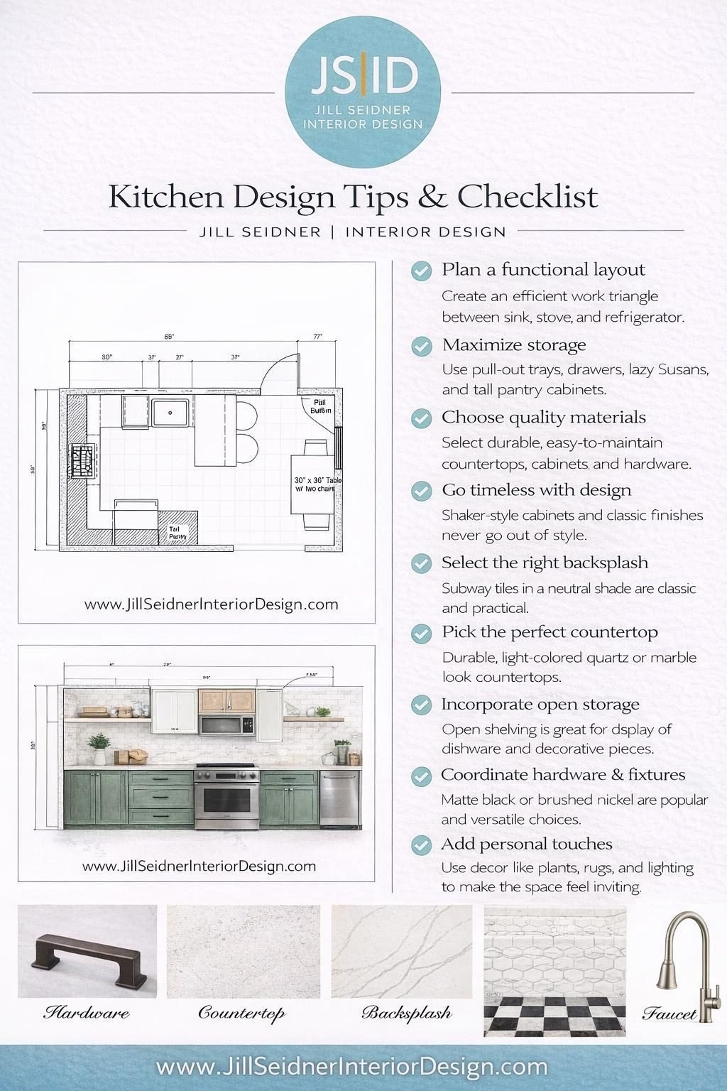
Kitchen refresh without a remodel: Jill Seidner's kitchen design tips and checklist with a kitchen floor plan, a green and white kitchen elevation and samples of hardware, countertop, backsplash, flooring and faucet
My kitchen tips and checklist. Save this one.

Here’s the kitchen I hear about most.

The cabinets are fine but builder-basic. Every flat surface holds something: the toaster, the mail, the fruit bowl, three bottles of olive oil. There’s one light in the middle of the ceiling that makes the whole room feel like an office at 6 PM. And in about five weeks, everyone is coming over.

Most of the time, that kitchen doesn’t need a remodel. It needs the same decisions I make on every kitchen I design, in the right order: work out how the room is used, give everything a home, then change the things you touch and see every day. Color, hardware, light and a little styling.

That’s the after: a kitchen that looks considered, cooks easier, and that you’re happy to have people standing around in with a glass of wine.

A kitchen refresh without a remodel: what’s in the full guide

The full post is for paid subscribers on Substack. In this guide, you’ll get:

  • The 10-minute kitchen test I run before I change a thing
  • How to clear your counters for good (and where each thing actually goes)
  • The two-tone cabinet formula, with five color pairings and the exact paints
  • The hardware rule that makes builder cabinets look custom
  • The three layers of kitchen light, with pendant heights and spacing
  • The small-kitchen numbers: aisles, stools, overhangs and landing space
  • How to style it so it looks lived-in, not staged

This is the free preview. The seven moves, the paint pairings and every measurement are in the full post on Substack.

Kitchen boards to borrow from

Every number in the full post comes from my Complete Home Design Guide. Planning more than one room? My Big Book of Mood Boards has a full section of kitchen boards to borrow from.


Want help with your own room?

If you’d rather hand the whole room to me, my Complete Room Design gives you a finished plan for one room: two layouts, a concept board, paint colors and a shopping list with links.


Kitchen refresh: FAQ

Does a tired kitchen need a remodel? Most of the time, no. It needs the right decisions in the right order: how the room is used, a home for everything, then the things you touch and see every day.

What should I change first? Start with how the room is used and clear the counters so everything has a home. Color, hardware, light and a little styling come after that.

Where are the paint colors and measurements? In the full post on Substack, for paid subscribers: five two-tone cabinet pairings with the exact paints, pendant heights and spacing, and the small-kitchen numbers for aisles, stools, overhangs and landing space.


More from Your Design Guide:


Thanks for reading Your Design Guide! Read more on Substack: subscribe free for new posts, or upgrade for all the perks.

Originally published on Your Design Guide. Read the full post and the comments on Substack: 7 Moves That Take a Tired Kitchen to Finished

Day 5: Style One Surface and Take the Photo

YOUR DESIGN GUIDE | 5-DAY SMALL SPACE REFRESH SPRINT

Day 5 of the 5-Day Small Space Refresh Sprint. Catch up: Day 1 · Day 2 · Day 3 · Day 4.

Monday you took three things out.

Tuesday you measured the walkways and moved one piece.

Wednesday you repeated one color three times.

Last night you turned the ceiling light off and the lamps on.

Today is the part that makes it look finished.

Small space styling guide: style one surface in a small living room with a tall, a medium and a low piece, then take the after photo from the doorway
Day 5: style one surface, then take the after photo from the doorway.

Today’s task (15 minutes):

  • Pick one surface: the coffee table, the console, the dresser top or the entry table
  • Clear it completely
  • Put back three things at three heights
  • Take the after photo from the doorway

1. One surface, not all of them

In a small room, one styled surface is enough. Two is good. Every surface styled is clutter with better intentions.

Pick the one you see first from the door.

2. Clear it completely

Everything off. Wipe it. Look at it empty for a second. In a small room, an empty surface is doing real work, so you’re only putting back what earns the spot.

3. Three things, three heights

Something tall: a lamp (you placed it yesterday), a vase with branches, a tall candle.

Something medium: a stack of two or three books, a small plant, a framed photo.

Something low: a bowl, a tray, a small dish.

Group the small things on the tray so they read as one. Leave empty space on the surface. If you can’t set down a cup of coffee, take one thing away.

The color from Wednesday? Put one of the three repeats here.

4. The photo

Same spot as Monday. Doorway, same angle, lamps on.

Then put Monday’s photo next to it.

You didn’t buy anything this week. You took things out, moved one piece, repeated a color, added light and styled one surface. That’s the order I work in on every project, and it’s the order most people do backwards.

What to do with the three things you took out

You lived without them for five days. If you didn’t miss them, they don’t go back. Move them to another room, or sell or donate them.

If you missed one, bring it back, and now you know it belongs.

Post your before and after

Comment with both photos, or just tell me what changed.

And if the sprint helped, the most useful thing you can do is send it to one person with a small space. That’s how this little publication grows.

November 1: the monthly room challenge returns

This was the short version. On November 1 we go back to the full 30-day format, and the room is Dining Nooks + Dining Rooms, just in time for Thanksgiving and holiday hosting.

Thirty days, one short lesson a day, for paid subscribers: the table size that actually fits, how many chairs, the light over the table, the rug (or no rug), the sideboard, the walls, and a plan for the one dinner you’re hosting.

If your dining room is a nook, a corner of the living room or a table against a wall, that’s exactly what the first week is about.

If the room still doesn’t sit right after this week, it’s usually the layout, not the stuff. The Room Layout Fix is my 7-day course for making a living room work with the furniture you already own: five layout formulas with plans, the spacing guide, the rug cheat sheet, the room editing checklist and a printable planning worksheet.


Want help with your own room?

If you’d like a second set of eyes on your room, book an online design consultation with me. Send your photos and we’ll go through the layout, the color and the styling together, so you know exactly what to do next.


Small space styling: FAQ

How many surfaces should I style in a small room? One is enough, two is good. Pick the one you see first from the door. Every surface styled is clutter with better intentions.

What should go on a coffee table or console? Three things at three heights: something tall (a lamp, a vase with branches, a tall candle), something medium (a stack of two or three books, a small plant, a framed photo) and something low (a bowl, a tray, a small dish).

How do I know when to stop? Leave empty space on the surface. If you can’t set down a cup of coffee, take one thing away.

How do I take a good before and after photo? Stand in the same spot as your before photo: the doorway, the same angle, lamps on. Then put the two photos side by side.


More from Your Design Guide:


Thanks for reading Your Design Guide! Read more on Substack: subscribe free for new posts, or upgrade for all the perks.

Originally published on Your Design Guide. Read the full post and the comments on Substack: Day 5: Style One Surface on Substack

The Long, Narrow Living Room: How to Make It Feel Like Two Rooms Instead of a Hallway

YOUR DESIGN GUIDE | THE LONG, NARROW LIVING ROOM

“How do I make my living space feel less like a hallway?” That’s a real question from Reddit, and it’s one of the most common ones I see. Others ask for help with their “weirdly long and narrow living room,” or with a narrow living room that has “multiple doorways.” One person simply asked: “Long living room layout – two zones?”

Yes. Two zones is the answer to a long, narrow living room layout, and today I’ll show you exactly how I lay one out, using a plan from my own drawing library: a living and dining room that’s only 10 feet wide and almost 29 feet long.

Long narrow living room layout: why long rooms feel wrong

A long, narrow room feels like a hallway for one reason: everything lines up along the two long walls and the middle becomes a runway. The sofa on one wall, the TV on the other, a table somewhere in between, and nothing tells your eye where one room stops and the next begins.

The fix isn’t more furniture or less furniture. It’s giving the room two clear jobs, each with its own anchor, and one clear path that runs past them, not through them.

An annotated floor plan of a 10 foot wide, 28 foot 9 inch long living and dining room with six colored numbered callouts and an ochre walk path arrow running along one side, door to door
Living Dining Layout Plan 06 from my Drawing & Layout Library, marked up to show the two zones and the walk path.

Zone by zone: how I read this plan

1. Zone 1: sit and talk. The sofa takes the long wall and faces the TV across the room. One 8×10 rug holds every piece in this zone. In a 10-foot-wide room an 8-foot rug leaves about a foot of floor on each side, which is just right.

2. A round coffee table. I chose a 36-inch round on purpose. In a narrow room, square corners catch knees and hips, and they reach into the path. Keep it 16 to 18 inches from the sofa so you can reach your cup.

3. The bench is the divider. A low bench sits at the end of the rug. It quietly says “the living room stops here” without blocking the light or the view down the room. A console or the back of a sofa can do the same job.

4. Zone 2: eat and gather. The table runs the long way, parallel to the walls. That one choice makes the room read as two rooms instead of one long one.

5. Storage on the long wall. A shallow buffet hugs the wall across from the table. It holds the dishes and the lamps and keeps the path open.

6. One art moment per zone. Art over the sofa and art by the table, each with its own light. When both ends feel finished, the room stops looking like a corridor with furniture in it.

And the most important line on the plan is the ochre arrow: the walk path runs along one side, door to door. Nothing sits in it, and no one has to zigzag between the sofa and the coffee table to get to the kitchen.

Long narrow living room layout numbers I use every time

A colorful card of living room spacing numbers: a 30 to 36 inch walk path, 16 to 18 inches from sofa to coffee table, a coffee table at least half the sofa length, a rug 6 to 8 inches wider than the sofa on each side, 12 to 18 inches of floor around the rug, and two zones
Keep these handy when you shop. Sources: Emily Henderson's design rules and Ruggable's rug size guide.
  • Walk path: 30 to 36 inches between the big pieces. If the room truly can’t give that, 18 to 24 inches is the floor.
  • Sofa to coffee table: 16 to 18 inches.
  • Coffee table size: at least half the length of the sofa.
  • Rug width: 6 to 8 inches wider than the sofa on each side, with the sofa’s front legs on the rug.
  • Floor around the rug: 12 to 18 inches of floor showing around it in a defined living area.

A tip for the TV: in a narrow room the sofa is closer to the screen than you’d like, so a wall-mounted TV (or a slim console under it) gives you back inches of depth. I wrote a whole post on where the TV should go if you’re stuck on that wall.

Do this, not that

A sage do panel and a terracotta don't panel listing what works and what makes a long narrow room feel worse
What I'd do, and what I'd skip, in any long room.

The one I see most often is the bowling alley: every piece pushed against the two long walls with nothing in the middle. It feels spacious on paper and empty in real life. The second is one long runner-style rug for the whole room. Two rugs, one per zone, do far more to make the room feel designed.

Watch the size of the sofa, too. A deep, oversized sectional eats a 10-foot width fast. A sofa with a tighter back and a lighter-scale accent chair leave you room to walk.

Shop the room: the narrow living room, done for you

Here’s the whole room, piece by piece, numbered to match the board.

I may earn a commission from links on this page.

A shop-the-room board of nine pieces for a long narrow living room: a rug, a round coffee table, an accent chair, a storage bench, a plug-in wall sconce, an arc floor lamp, a wall mirror, a console table and a picture light
The narrow living room, done for you. Every piece links below.
  1. Burdick Handwoven Wool/Cotton Area Rug (AllModern): size it so the sofa’s front legs sit on it. Shop it
  2. Eleanne Single Coffee Table (Joss & Main): round, so there are no corners in your path. Shop it
  3. Bobbi Upholstered Accent Chair (Joss & Main): light in scale, so it won’t block the path. Shop it
  4. 48″ Upholstered Storage Bench (Birch Lane): the divider at the end of the rug, with storage inside. Shop it
  5. Tailor Plug-In Wall Sconce (CB2): light on the long wall without using floor space. Shop it
  6. Big Dipper Arc Floor Lamp (CB2): arcs over the sofa so you can skip a side table. Shop it
  7. Ethel Wall Mirror (McGee & Co.): on the long wall it bounces the window light down the room. Shop it
  8. Console Table (Birch Lane): a slim console works as the buffet in the dining zone. Shop it
  9. Acosta Picture Light (Lulu and Georgia): lights the art in each zone so both ends feel finished. Shop it

Draw your own room

The plan in this post is one of 85 in my Drawing & Layout Library, along with a guide to reading design drawings and printable planning sheets, so you can find a plan close to your room and draw your own on top of it.


Want help with your own room?

If you’d rather I do the layout, my Complete Room Design is on sale for $397: send me your measurements and photos, and I’ll design the room for you, from the floor plan to the shopping list.


Long narrow living room layout: FAQ

How do I make a long, narrow living room feel less like a hallway? Give it two zones, each with its own anchor: a seating area on one rug and a dining or reading area beyond it, with one clear walk path running along one side, past the furniture rather than through it.

How much walkway space do I need in a narrow living room? 30 to 36 inches between the big pieces is ideal. If the room truly can’t give that, 18 to 24 inches is the floor.

What size rug works in a 10-foot-wide room? An 8×10 usually works: it leaves about a foot of floor on each side. Size it so the sofa’s front legs sit on it, with the rug 6 to 8 inches wider than the sofa on each side.

Should I use one long rug for the whole room? No. One rug per zone does far more to make a long room feel designed than a single runner-style rug.


Sources

More from Your Design Guide: Where Should the TV Go? · Before I Buy a Single Piece of Furniture


Thanks for reading Your Design Guide! Read more on Substack: subscribe free for new posts, or upgrade for all the perks.

Originally published on Your Design Guide. Read the full post and the comments on Substack: The Long, Narrow Living Room on Substack

Small Bathroom Remodel: Settle the Layout Before You Pick a Single Tile

YOUR DESIGN GUIDE | SMALL BATHROOM REMODEL

Every week on Reddit’s remodeling boards I see the same posts. “Help me pick out the bathroom tile I need to choose quick.” “Lost trying to choose bathroom tiles.” And right next to them: “Is toilet too close to sink?” and “Not sure if space between tub and vanity will feel too tight?”

Those two kinds of questions are really one question asked in the wrong order. The tile can’t be right until the layout is right, because the layout decides how much tile you need, where the hero tile goes, how big the vanity can be and whether the shower glass even opens. In my own decision order, tile is step six. Today I’ll walk you through everything that comes before it, with the drawings I use and the real numbers behind them.

Small bathroom remodel layout, step 1: measure and draw the room you actually have

Before anything else, draw the room to scale. Graph paper is fine. Measure wall to wall, then mark the door, the window, and two points most people forget: the center of the toilet drain and the center of the sink. Those two marks are the most expensive points in the room.

A scaled floor plan of a 5 by 8 foot bathroom with a tub, vanity and toilet, marked with six colored, numbered callouts for tub, vanity, toilet centerline, clear floor, door swing and window plus fan
The classic 5×8 bath, drawn to scale and marked the way I mark every bathroom before a remodel.

Here is what I look at on a plan like this one:

  1. The tub or shower. The standard tub in a 5×8 bath is 30 by 60 inches. Swapping it for a walk-in shower is the biggest layout change you can make in this room, and it’s worth deciding first.
  2. The vanity. Measure from the center of the sink to the side wall. That number tells you how wide a vanity can really be.
  3. The toilet centerline. This is the measurement from the middle of the toilet to the wall or fixture beside it.
  4. The clear floor in front. The open floor you stand on at the vanity and the toilet.
  5. The door swing. Does the door hit the toilet or the vanity when it opens?
  6. The window and the fan. A window is lovely. You still want an exhaust fan.

Step 2: Know the numbers (the recommended ones and the minimums)

Someone on Reddit asked it perfectly: “How much space on either side of the toilet?” Here’s the honest answer: there’s a code minimum, and there’s what feels good. The National Kitchen & Bath Association publishes both in its Bathroom Planning Guidelines, and these are the ones I keep on my desk.

A colorful card of bathroom clearance numbers: 30 inches of clear floor, 18 inches from the toilet centerline, 20 inches from the sink centerline, 36 inches between two sinks, a 36 by 36 inch shower, a 32 inch door opening, a 50 cfm fan and a 36 by 66 inch toilet room
Recommended first, code minimum underneath. Source: NKBA Bathroom Planning Guidelines.
  • Clear floor: 30 inches in front of the toilet, vanity and tub is recommended. The code minimum is 21 inches, and 24 inches in front of a shower entry. You will feel the difference between 21 and 30 every single morning.
  • Toilet: 18 inches from the toilet’s centerline to any wall or fixture is recommended. Code says no less than 15.
  • Single sink: 20 inches from the sink’s centerline to the side wall is recommended; 15 is the minimum.
  • Double sinks: 36 inches between the two centerlines is recommended; 30 is the minimum. If you can’t get 30, one generous sink is the better choice.
  • Shower: 36 by 36 inches inside is recommended. The code minimum is 30 by 30 (900 square inches).
  • Door: a clear opening of at least 32 inches, which a 2’10” door gives you.
  • Fan: a fan of at least 50 cubic feet per minute, vented to the outside, if you don’t have an operable window of at least 3 square feet.

Why this matters before tile: if your toilet needs 18 inches and your sink needs 20, the vanity width is simply what’s left over. Choose a vanity you love that’s 6 inches too wide and you lose the clear floor you’ll use every day.

Step 3: Decide what stays

This is where budgets are won or lost. Moving a toilet drain or a shower drain is real money, often more than the tile itself. Before you dream about relocating anything, ask whether the room works with the plumbing where it is.

A plumbing plan of the 5 by 8 bathroom showing where moving drains costs more, above six color-coded steps: measure, decide what stays, lay out clearances, fix the door, size the vanity light and fan, then choose tile
My decision order, with the plumbing plan from my bathroom guide. The marked moves are the expensive ones.

Most of the small bathrooms I design keep the toilet where it is. When I designed a tiny bathroom a while back, the smartest move was off-centering the sink so there was more counter to stand at. That small shift cost far less than moving a drain and made the room feel bigger.

If you’re thinking about trading the tub for a walk-in shower, you’re not alone: the 2025 Houzz Bathroom Trends Study found that 39 percent of renovating homeowners made their shower bigger. Just check the 36 by 36 recommendation against your plan before you commit, and think about who will use the bath. Many people still want one tub in the house.

Step 4: Fix the door, then size the vanity, light and fan

Once the clearances are drawn, look at the door. If it swings into the toilet or traps you between the door and the vanity, swing it the other way or look at a pocket door. NKBA also recommends that a hinged shower door swing out, into the room, so draw that arc too.

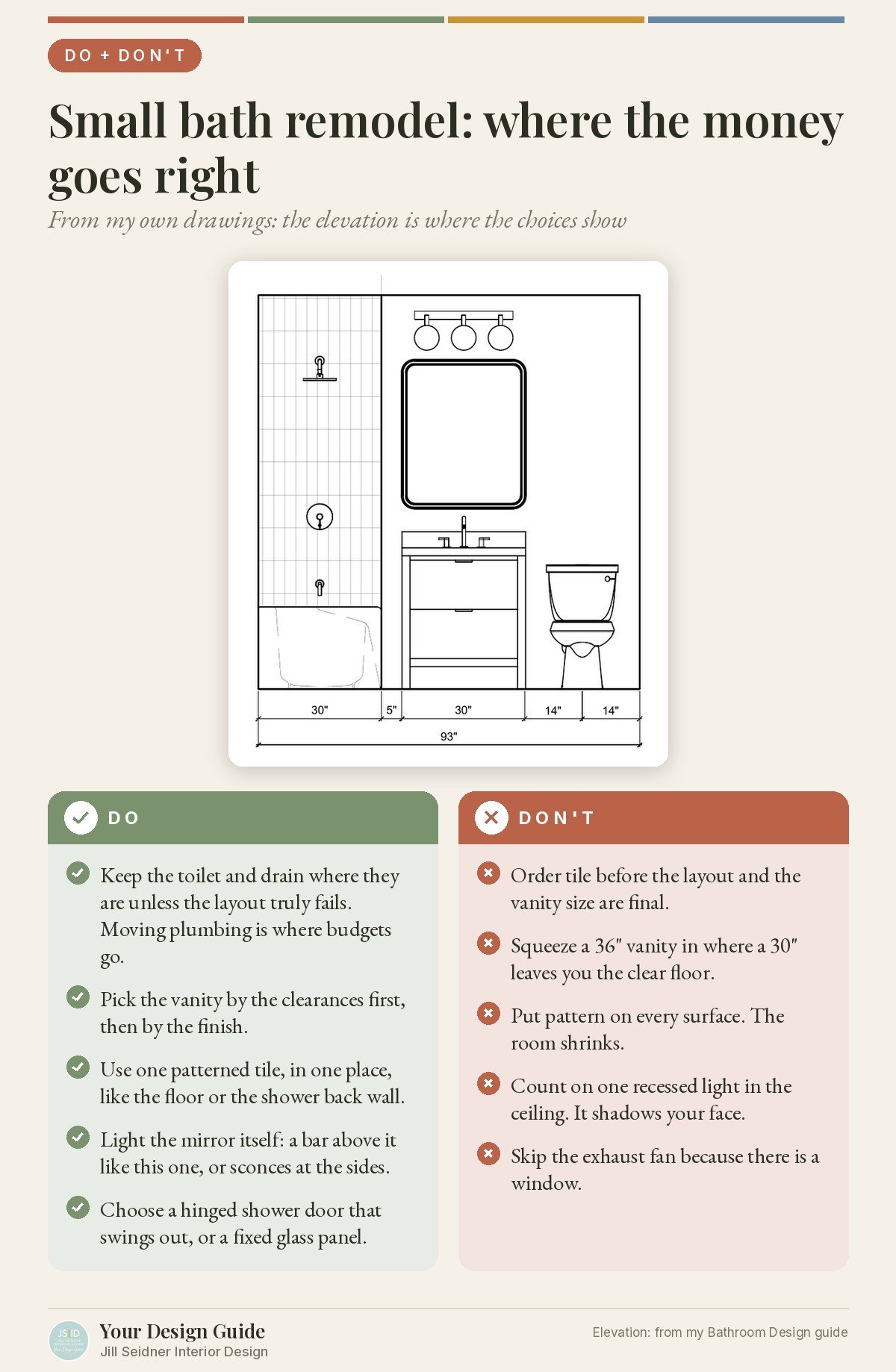
Now you know your real vanity width. In a 5×8 bath that’s usually a 24- or 30-inch vanity. A floating vanity shows more floor and makes a small room feel wider.

Light the mirror itself, with a bar above it or sconces at the sides, so your face isn’t in shadow. And plan the exhaust fan now, while the ceiling is open.

A bathroom elevation drawing of a vanity, mirror and light above a sage do panel and a terracotta don't panel listing small bathroom remodel choices
Do and don't, with the vanity elevation from my bathroom guide.

Step 5: Then choose the tile

Here’s where it gets fun, and it’s so much easier now. You know the floor area, the shower walls, and where the eye lands when you open the door. My rule for small baths: one patterned or hero tile in one place (the floor or the back wall of the shower) and quiet tile around it. Pattern on every surface makes a small room feel smaller. Repeat one metal finish on the faucet, the light and the hardware, and the room looks designed instead of collected.

Shop the finish

Once the tile is set, it’s the finishing pieces that make it feel like yours. These are the ones I’d put in a small bath.

I may earn a commission from links on this page.

A shop-the-room board of six bathroom finishing pieces: an oval mirror, a semi flush ceiling light, a brass hook rack, a tray, a woven basket and a vase
Six finishing pieces for a small bath. Numbered to match the list below.
  1. Kitson Oval Mirror (McGee & Co.): an oval softens all the hard lines of tile. Shop it
  2. Hastings Semi Flush Mount (McGee & Co.): a ceiling light with some presence, not a builder dome. Shop it
  3. Murphy Brass Hook Rack (McGee & Co.): hooks beat towel bars in a tight bath. Shop it
  4. Kingsley Tray (McGee & Co.): corrals the vanity top so the counter stays clear. Shop it
  5. Salter Woven Basket (McGee & Co.): rolled towels, no linen closet needed. Shop it
  6. Natalia Vase (McGee & Co.): one stem by the sink is all the styling it needs. Shop it
  7. Lutron Caseta Smart Dimmer Switch (Best Buy): put the vanity light on a dimmer for soft light at night. Shop it

Do it with my planner

If you want to work through this on paper, my Bathroom Design Toolkit has everything from this post and more: my How to Design a Bathroom guide, a Clearance Planner and a Tile Layout Planner, ready to print.


Want help with your own room?

If you’d rather hand me your measurements and photos, book an online design consultation and we’ll work through your bathroom together, from the layout to the last tile.


Small bathroom remodel layout: FAQ

What should I decide first in a small bathroom remodel? The layout. Measure and draw the room to scale, mark the toilet drain and sink centers, and settle the clearances before you choose any tile.

How much space do you need on either side of a toilet? The NKBA recommends 18 inches from the toilet’s centerline to any wall or fixture; the code minimum is 15 inches. Check your local code with your contractor.

How much clear floor space should be in front of a toilet or vanity? 30 inches is recommended. The code minimum is 21 inches, and 24 inches in front of a shower entry.

What size vanity fits a 5×8 bathroom? Usually a 24- or 30-inch vanity, once the toilet and sink clearances are drawn. A floating vanity shows more floor and makes the room feel wider.


Sources

Codes vary by city. Check your local requirements with your contractor before you build.

More from Your Design Guide: Design Process: How I Designed a Tiny Bathroom · How This Bathroom Remodel Evolved


Thanks for reading Your Design Guide! Read more on Substack: subscribe free for new posts, or upgrade for all the perks.

Originally published on Your Design Guide. Read the full post and the comments on Substack: Small Bathroom Remodel on Substack

Day 4: Light It Like a Designer (Three Lamps, Twenty Minutes)

YOUR DESIGN GUIDE | 5-DAY SMALL SPACE REFRESH SPRINT

Day 4 of the 5-Day Small Space Refresh Sprint. Catch up: Day 1 · Day 2 · Day 3. Missed the plan? Start here.

Turn on the ceiling light in your small room tonight and look at the corners.

They’re dark.

One overhead light lights the middle of the room and leaves the edges in shadow, and your eye reads the room as ending where the light ends. The room looks smaller than it is.

Three lamps fix this, and you probably own three lamps.

Visual guide to lighting a small living room like a designer: three lamps, three heights, warm 2700K bulbs
Day 4: three lamps, three heights, warm 2700K bulbs.

Today’s task (20 minutes):

  • Count the lamps in the room (and in the house)
  • Place three in a triangle, at three different heights
  • Check the bulbs for the one number that matters
  • Turn the ceiling light off tonight and look again

1. Three lamps, three heights

In almost every room I design, I plan three layers of light: something high, something at eye level, something low.

In a small room, that’s:

High: the ceiling fixture, or a wall sconce if you have one. Leave it.

Eye level: a table lamp on a side table, console or dresser.

Low: a floor lamp in a corner, or a small lamp on a low shelf or the floor behind a chair.

Put them in a triangle across the room, not all on one side. The corners you’re lighting are the ones that were dark.

2. Borrow from the bedroom

If the room has one lamp, the house has more. A bedroom lamp works on a living room console for a week. A desk lamp works on a bookshelf.

You’re testing whether three lamps change the room. They will. Then you decide what, if anything, to buy.

3. The bulb number

Look at the bulb box or the bulb itself for a number followed by K.

2700K is warm white. It’s what I use in living rooms and bedrooms. The room feels like evening.

3000K is a little cooler. Fine for a kitchen or a bathroom.

4000K and up is office light. It makes a small room look like a waiting room. If one of your lamps has it, that’s the lamp that’s been bothering you.

Mixed temperatures in one room read as “something’s off” even when you can’t name it. Make them match, warm.

4. Mirror across from the window

One more move while you have twenty minutes. If there’s a mirror anywhere in the house, lean it on the wall across from the window, or across from one of the lamps. It doubles the light you just added.

5. Tonight: ceiling light off

Turn the three lamps on and the overhead off. Stand in the doorway.

That’s the room. That’s what it was supposed to look like.

If you only do one thing

Put a lamp in the darkest corner and turn it on. One lamp in a dark corner does more for a small room than any piece of furniture.

Show me before and after

Comment with your lamp count, before and after, and the bulb temperature you found, on the Substack post. If you found a 5000K bulb in a living room lamp, you’re not alone.

Know someone whose apartment has one overhead light and nothing else? Send them this one.


Lighting is one of the steps in The Apartment Set Up Guide + Workbook, my room-by-room system for setting up a small place in the right order: measure, layout, rug sizes, color, lighting, then shopping, with a workbook and budget spreadsheet.

More from Your Design Guide:


Want help with your own room?

If the lamps are only the start and the whole room needs a plan, my $397 Complete Room Design does it online: two layouts, a concept board, paint colors and a shopping list with links, for any room, anywhere.


Lighting a small room: FAQ

Why does my small room feel smaller at night? One overhead light lights the middle of the room and leaves the corners dark, and your eye reads the room as ending where the light ends.

How many lamps does a small living room need? Three, at three heights: the ceiling fixture or a sconce up high, a table lamp at eye level, and a floor lamp or small low lamp in a corner. Place them in a triangle across the room.

What bulb color is best for a living room? 2700K, warm white. 3000K is fine for a kitchen or bathroom; 4000K and up reads as office light in a small room. Keep every bulb in one room the same warm temperature.

Do I need to buy new lamps? Not to start. Borrow lamps from other rooms for a week to test the triangle, then decide what, if anything, to buy.


Thanks for reading Your Design Guide! Read more on Substack: subscribe free for new posts, or upgrade for all the perks.

Originally published on Your Design Guide. Read the full post and the comments on Substack: https://yourdesignguide.substack.com/p/sprint-day-4-light-it-like-a-designer

Custom Closet Design Ideas: Layout, Finishes and Organization

Custom closet design ideas usually start with the finishes. I start somewhere else. A well-designed closet changes more than storage. It changes how your mornings feel.

The closets I’m drawn to most aren’t necessarily the largest. They’re the ones that feel intentional. Everything has a place. The layout works naturally. Drawers hold the smaller everyday pieces. Hanging space is planned around what’s actually worn most. Shelving becomes both practical and visual.

This guide walks through the closet from my design guide pin: a timeless, tailored reach-in closet with warm gray cabinetry, modern hardware and intentional storage for effortless organization.

Custom closet design ideas guide by Jill Seidner: warm gray reach-in closet with double hanging, center drawers, upper shelving, matte black hardware, plan and elevations
My closet design guide: finishes, hardware, the layout drawings and the organization features. See the original pin on my Pinterest.

Start with function, then the finishes

One of the biggest mistakes I see is focusing only on aesthetics before thinking about function. A beautiful closet still needs flow. The way you move through the space matters just as much as the finishes.

So before you pick a paint color or a pull, look at what you actually own and wear. How much is long hanging, how much is short? What lives folded? What do you reach for every day, and what only comes out once a season? That list is your real design brief.

A custom closet layout that works

The closet in my guide is 2 feet deep and 10 feet tall, divided into three 19-inch sections. Here is how each part earns its space:

  • Double hanging on the sides. Two rods stacked in one section maximizes vertical space for shirts, jackets and pants.
  • A bank of drawers in the center. Drawers keep smaller items organized and out of sight, and give the closet a calm middle.
  • Upper shelving across the top. Ideal for linens, bags and seasonal items, the things you don’t need every day.
  • Integrated LED lighting. Better visibility, softer shadows and a touch of luxury.

I always draw it three ways: a plan view, a front elevation and a side elevation. The plan tells you whether you can move comfortably. The elevations tell you where every rod, shelf and drawer lands before anyone builds a thing. If you have never measured a room for a plan, my post on measuring the walkways is a good place to start.

If you want to see how designers draw closets, my Drawing & Layout Library ($29) has 85 of my floor plans and elevations sorted by room, closets included, plus a guide to reading design drawings and printable planning sheets so you can sketch your own.

Closet finishes and hardware

For this closet I chose:

  • Paint: SW 7030 Anew Gray by Sherwin-Williams, a warm gray that reads tailored, not cold.
  • Knobs: 1 1/4-inch diameter, matte black.
  • Pulls: 6-inch center-to-center, matte black.

The rule I follow: consistent finishes and hardware throughout. One paint color and one hardware finish is what makes a closet look custom and tailored instead of pieced together.

Details that make a closet feel elevated

A few details that instantly make a closet feel more elevated:

  • Double hanging sections to maximize vertical space
  • Integrated lighting to soften shadows and improve visibility
  • Deep drawers for smaller accessories and folded items
  • Adjustable shelving for flexibility over time
  • Built-in benches or seating areas for function and warmth
  • Consistent finishes and hardware throughout for a tailored look

I also love incorporating architectural details like arched doors or niches because they soften the space and make storage feel more custom instead of purely utilitarian.

And most of all: designed for you. A custom layout tailored to your wardrobe and your daily routine is what turns everyday routines into moments of ease.


Want help with your own room?

If your closet, or the bedroom around it, isn’t working and you’d like a designer’s eyes on it, book an online design consultation with me. We’ll look at your space together and make a plan.


Custom closet design FAQ

How deep should a closet be? The closet in this guide is 2 feet deep, which gives hanging clothes room without wasting floor space.

Is double hanging worth it? For shirts, jackets and folded-over pants, yes. Two rods in one section maximizes vertical space. Keep one section for longer pieces.

What goes on the top shelves? Linens, bags and seasonal items: anything you don’t reach for every day.

What color should I paint a closet? A warm gray like SW 7030 Anew Gray keeps it tailored and timeless, especially with matte black hardware.


I share guides like this every week on Your Design Guide, with the full how-to, the drawings and my design kits for members.

New for Paid Members: Ask a Designer Wednesday

Starting today, Your Design Guide has a weekly thread in the Chat called Ask a Designer Wednesday, and it’s just for paid members. If you’ve ever wanted to ask an interior designer about your own room, this is the place to do it.

Ask an interior designer: a styled living room with a sofa, art and layered lighting, the kind of room members bring to Ask a Designer Wednesday
Ask a Designer Wednesday: bring the room that’s been bugging you.

How Ask a Designer Wednesday works

Every Wednesday morning I’ll open a new thread. Members reply with a photo of a room they’re working on, or the design question they’re stuck on.

A layout that isn’t working.

A paint color you can’t commit to.

A sofa you’re not sure about.

A rug that might be too small. (It usually is.)

I’ll answer right there in the thread. And the other questions are worth reading too. Most weeks someone is stuck on the exact same thing you are.

Already a paid member?

You’re in. The first thread is open now. Bring the room that’s been bugging you.

Reading for free?

I’d love to see your room too. Ask a Designer Wednesday comes with a paid subscription, along with the monthly 30-Day Room Redesign Challenge and The Design Toolkit (and the free design kits in the Member Library). You can try it free for 7 days.

See you Wednesday,

Jill


Between Wednesdays

If you want the answers before you ask, my Complete Home Design Guide is the 151-page version of what I’d tell you in the thread: layouts, dimensions, color, lighting and styling, room by room. It’s $47 on Gumroad.


Want help with your own room?

A chat answer fixes one question. If the whole room needs a plan, my $397 Complete Room Design does it online: two layouts, a concept board, paint colors and a shopping list with links, for any room, anywhere.


Ask a Designer Wednesday: FAQ

Who can post in the thread? Paid members of Your Design Guide. Free readers can see the thread, but replies are a paid-member perk.

What should I bring? A photo of the room and one clear question: the layout, a paint color, the sofa, the rug size. The more specific the question, the more useful my answer.

When do you answer? Wednesdays, right in the thread, so everyone can read the answers.

Is there a free trial? Yes, the paid subscription comes with a 7-day free trial.


Originally published on Your Design Guide. Read the full post and the comments on Substack: https://yourdesignguide.substack.com/p/ask-a-designer-wednesday

Day 3: One Color, Three Repeats

YOUR DESIGN GUIDE | 5-DAY SMALL SPACE REFRESH SPRINT

Day 3 of the 5-Day Small Space Refresh Sprint. Day 1: the edit. Day 2: the walkways. Missed the plan? Start here.

Here’s something I do in almost every room I design, and almost nobody does at home.

I pick one color that’s already in the room, and I make sure it shows up three times.

Not everywhere. Three times.

Once in something big. Once in something medium. Once in something small.

That’s it. The room reads as planned, because now it is.

In a small room this matters more, not less. There’s less space to hide a color that only appears once, and a lone color is what makes a room look like a collection of things instead of a room.

Visual guide to pulling a small living room together with one accent color repeated three times
Day 3: one color, three repeats, placed in a triangle.

Today’s task (20 minutes):

  • Find the color that’s already in your rug, art or sofa
  • Find it twice more somewhere in the house
  • Move those two things into the room
  • Take out anything that’s the only one of its color

1. Pick the color that’s already there

Look at the three biggest things in the room: the rug, the sofa or bed, the art. One of them has a color you like. Not the main color. The second one.

The rust in the rug. The green in the painting. The navy in the pillow you keep.

That’s your color.

2. Find it twice more

Go room to room. You’re looking for two more things in that color, in two different sizes:

Medium: a throw, a lampshade, a chair cushion, a stack of books with that spine color, a vase.

Small: a candle, a bowl, a picture frame, a single pillow.

They don’t have to match. A rust throw and a terracotta bowl count. Same family is enough.

3. Place the one color in a triangle

Big thing on one side of the room. Medium on the other. Small somewhere between.

If your eye moves between the three without stopping, it’s working.

4. Take out the orphan

Now find the thing that’s the only one of its color in the room. The lone teal vase. The one red pillow.

Out it goes, into another room. (It might find two friends there.)

If you only do one thing

Move one throw or one pillow in your rug’s second color onto the sofa or the bed. One move, and the rug finally looks like it belongs.

Show me the three

Comment with your color and where it shows up three times. Photos are welcome in the comments on the Substack post if you’re in the app.

If someone you know keeps buying pillows and the room still doesn’t work, send them this. It’s probably a repeat problem, not a pillow problem.

Thanks for reading Your Design Guide! Subscribe for free to receive new posts, or upgrade for all the perks.


If you want a whole palette to work from instead of one color, The Big Book of Mood Boards is 100+ designer mood boards across 122 pages, every room and every style, with the palettes, furnishings and finishes shown together.

Paid subscribers get the complete Your Design Guide library: furniture formulas, layouts, designer measurements, room checklists, sourcing ideas and saveable visual guides.

Founding Members

Founding Members also receive a complimentary 1-hour online interior design consultation — a $150 value.

More from Your Design Guide:


Want help with your own room?

If you can’t decide which color in the room deserves the repeats, or the palette never quite settles, that’s what my color consultations are for: we look at your room together and I pick the colors, the paint and where each one shows up. Color consultations are $150 an hour, online or in person.


One color, three repeats: FAQ

How do I make a room look pulled together without buying anything? Pick one color that’s already in the room and make sure it shows up three times: once in something big, once in something medium, once in something small. The room reads as planned, because now it is.

Which color should I repeat? Look at the three biggest things in the room (the rug, the sofa or bed, the art) and take the second color in one of them, not the main one. The rust in the rug, the green in the painting, the navy in the pillow you keep.

Do the three pieces have to match exactly? No. A rust throw and a terracotta bowl count. Same family is enough.

Where should the three go? In a triangle: the big thing on one side of the room, the medium on the other, the small somewhere between. If your eye moves between the three without stopping, it’s working.


Originally published on Your Design Guide. Read the full post and the comments on Substack: https://yourdesignguide.substack.com/p/sprint-day-3-one-color-three-repeats

Day 2: Measure the Walkways (Then Move One Piece)

YOUR DESIGN GUIDE | 5-DAY SMALL SPACE REFRESH SPRINT

Day 2 of the 5-Day Small Space Refresh Sprint. Yesterday: the 20-minute edit. Missed the plan? Start here.

Yesterday a lot of you took out a chair. Good.

Today, grab a tape measure. This takes fifteen minutes and it will change how you see the room.

Small rooms don’t feel cramped because they’re small.

They feel cramped because you can’t walk through them without turning sideways.

Visual guide to small living room walkway clearance: 30 to 36 inch main path, 14 to 18 inches from sofa to coffee table
Day 2: the walkway clearance numbers I use in every small room.

Today’s task (15 to 30 minutes):

  • Measure every walkway in the room: door to sofa, sofa to coffee table, bed to dresser, anywhere you walk
  • Compare against the numbers below
  • Move one piece to fix the worst one
  • Walk it three times

The walkway clearance numbers I use

Main walkway (the path you take through the room): 30 to 36 inches. Under 30, and the room feels tight every single time you cross it. Thirty is fine in a small space. You don’t need 36.

Sofa to coffee table: 14 to 18 inches. Closer than 14 and you bang your shins. Farther than 18 and you can’t reach your coffee.

Around a bed: 24 inches minimum on the sides you use to get in and out. One side can be against the wall in a studio, and that’s a real designer move, not a compromise.

In front of a dresser or a closet: 36 inches so the drawers and doors open with you standing there.

Dining chairs: 36 inches behind the chair to pull it out and sit down. In a nook, 24 works if nobody has to walk behind it.

Write yours down next to the number. Most small rooms have one walkway that’s at 20 inches. That’s the one.

Move one piece

Now fix the worst walkway with one move. Not a new layout. One move.

The moves that fix it most often:

Pull the sofa off the wall 2 to 3 inches and angle nothing. It sounds backwards, but it usually frees the path on the other side of the room because the coffee table and rug shift with it.

Turn the coffee table 90 degrees or swap it for the side table you took out yesterday if it’s smaller.

Slide the bed to the wall in a studio or small bedroom. You get a real walkway on the other side instead of two bad ones.

Rotate the dining table so the long side runs with the walkway, not across it.

Take the second nightstand out. One good one is enough in a small bedroom.

Walk it

Walk the path three times at normal speed. If you don’t turn your shoulders, you’re done.

If you still do, the piece is too big for the spot, and now you know that before you buy anything.

If you only do one thing

Measure the main walkway. If it’s under 30 inches, move whatever is narrowing it, even by three inches.

Tell me your worst number

Leave a comment with your tightest walkway, before and after. The usual culprit is a sectional or a coffee table that’s a few inches too big for the spot, and the usual fix is a few inches, not a new piece.

Know someone who turns sideways to get to their sofa? Send them this.

Thanks for reading Your Design Guide! Subscribe for free to receive new posts, or upgrade for all the perks.


Want to see how I plan a room on paper before moving anything? Interior Design Drawings + Space Planning Layouts is my library of hundreds of real floor plans, elevations and lighting plans from my projects, organized by room, so you can see the spacing drawn out.

More from Your Design Guide:


Want help with your own room?

If your walkways still don’t add up, this is exactly what I draw for clients: a furniture layout on paper, to scale, with every clearance marked before anything gets moved or bought. My design drawings, plans and furniture layouts are $150 an hour.


Walkway clearance FAQ

How wide should a walkway be in a small living room? 30 to 36 inches for the main path through the room. Under 30 inches the room feels tight every time you cross it; 30 is fine for one person, 36 is comfortable.

How much space should be between the sofa and the coffee table? 14 to 18 inches. Closer than 14 and you bang your shins; farther than 18 and you can’t reach your coffee.

How much clearance does a bed need? 24 inches minimum on the sides you use to get in and out. In a studio or small bedroom one side can go against the wall, and that is a real designer move, not a compromise.

How much room do dining chairs need behind them? 36 inches behind the chair to pull it out and sit down. In a nook, 24 works if nobody has to walk behind it.


Originally published on Your Design Guide. Read the full post and the comments on Substack: https://yourdesignguide.substack.com/p/sprint-day-2-measure-the-walkways

Day 1: The 20-Minute Edit (Take Three Things Out)

YOUR DESIGN GUIDE | 5-DAY SMALL SPACE REFRESH SPRINT

Day 1 of the 5-Day Small Space Refresh Sprint: five free tasks, 15 to 30 minutes each, Monday to Friday. Missed the plan? Start here.

Setting up a small space? My Apartment Setup Kit (the apartment guide plus The Room Layout Fix lessons and workbook) has everything you need to set up your place.

When a client tells me a small room feels cramped, the first thing I do isn’t measure.

I look for what’s in the way.

An extra side table.

A chair nobody sits in.

A basket that became a pile.

Three throw pillows too many.

A plant stand in the walkway.

Almost every small room I walk into has two or three things that are only there because they were already there. Take them out and the room gets bigger without moving a wall.

That’s today.

Visual guide to editing a small living room in 20 minutes by taking three things out
Day 1: the 20-minute edit. Take three things out of the room.

Today’s task (20 minutes):

  • Stand in the doorway and look at the room like you’ve never seen it
  • Find three things that are in the way, duplicated or just not working
  • Take them out of the room (not “away,” just out, for the week)
  • Live with it until Friday

1. Stand in the doorway

Don’t start inside the room. Start at the door, where everyone sees it first.

What’s the first thing your eye lands on? If it’s the back of a chair, a tangle of cords or a pile, that’s your first candidate.

2. The three I’d look for

The extra seat. A small room usually needs one good place for everyone to sit, not a seat in every corner. The chair nobody sits in is almost always the one taking the most space.

The doubled surface. Two side tables where one would do. A nesting table that never nests. An ottoman and a coffee table. Pick one.

The small stuff that reads as clutter. Five little things on a surface read as a mess. One tray with three things on it reads as styled. Today, just clear the surface. We style it on Friday.

3. Out of the room, not out of the house

Put the three things in another room, a closet or the hallway. This is a test, not a purge.

By Friday you’ll know which ones you miss. (You usually miss none of them.)

4. Take a photo

One photo from the doorway, before and after. You’ll want it on Friday.

If you only do one thing

Take out the chair nobody sits in.

If you can’t decide which one that is, it’s the one with the laundry on it.

Tell me what you took out

Leave a comment with your three. I read every one, and tomorrow I’ll pull a few into the post.

And if someone you know has a room that feels too full, send them this. Day 1 works best with company.


Free, every week: layouts, measurements and the small fixes that make a room look designed.

Paid subscribers get the complete Your Design Guide library: furniture formulas, layouts, designer measurements, room checklists, sourcing ideas and saveable visual guides.

Founding Members

Founding Members also receive a complimentary 1-hour online interior design consultation — a $150 value.

Want help with your own room?

If you would rather do the edit with a designer looking over your shoulder, my Room Refresh service is a one-room accessorizing refresh ($350 per room): I tell you what to take out, what to move and the few pieces worth adding, so the room finally feels finished.

More from Your Design Guide:


Day 1 FAQ

How long does the Day 1 small space refresh take? About 20 minutes. Stand in the doorway, find three things that are in the way, and take them out of the room.

Do I have to get rid of the three things? No. Put them in another room, a closet or the hallway until Friday. It is a test, not a purge, and by Friday you will know which ones you actually miss.

What if I cannot decide what to take out of a small room? Start with the chair nobody sits in. If you cannot tell which one that is, it is the one with the laundry on it.


Originally published on Your Design Guide. Read the full post and the comments on Substack: https://yourdesignguide.substack.com/p/sprint-day-1-the-20-minute-edit